One of the leading causes of conversion issues for online stores is a poorly designed ecommerce website that’s difficult to navigate through, not optimized for the user and unexciting to look at. When a website isn’t functional to use, consumers would rather shop elsewhere, as there is so much choice available when it comes to optimized and reputable ecommerce websites.
This can make it problematic for small online businesses to compete against big-box ecommerce retailers that have the time, power, and money to invest in creating an excellent ecommerce website for their users. It can also be difficult for entrepreneurs starting their very first online business to know what it takes to create a beautiful ecommerce store, and how to actually make it functional for their users.
While ecommerce website design might not seem important when there are so many other aspects of building a business that requires time and effort as well, it’s crucial to remember how pivotal of a role your website plays in your conversion strategy. It’s one of the first points of contact between you and your customers, it’s the home base that all your social platforms and ad channels link back to, it’s a visual representation of the value your business brings to your customers, and it gives your brand credibility. Websites that are poorly designed, haphazardly put together and unimpressive overall often deter customers from placing orders because they don’t look legitimate. If you don’t enjoy shopping on dodgy-looking websites it’s likely that your customers don’t, either.
It’s no longer sufficient to quickly throw together an ecommerce website with no style or personality if you want to engage customers and encourage them to make a purchase. We’ve rounded up 50 ecommerce websites that have made an effort to create beautiful and functional websites that attract consumers and inspire them to convert, and we hope you can take inspiration from them to infuse in your own ecommerce website design.
Take note of how they structure their homepages, their use of imagery, the typefaces they pair together, and their calls-to-action that lead customers to their products or other pages on their website. Try to understand why these ecommerce businesses made the choices that they did when it comes to design as it was likely all created with an intention behind it. Consider each website’s unique style—how they communicate their personality through photos and copy—and think about how you could do the same for your brand.
Get ready to be inspired by these creative, beautiful and functional ecommerce websites that successfully convert their visitors into paying customers.
50 Beautiful & Creative Ecommerce Website Designs
41 Watch
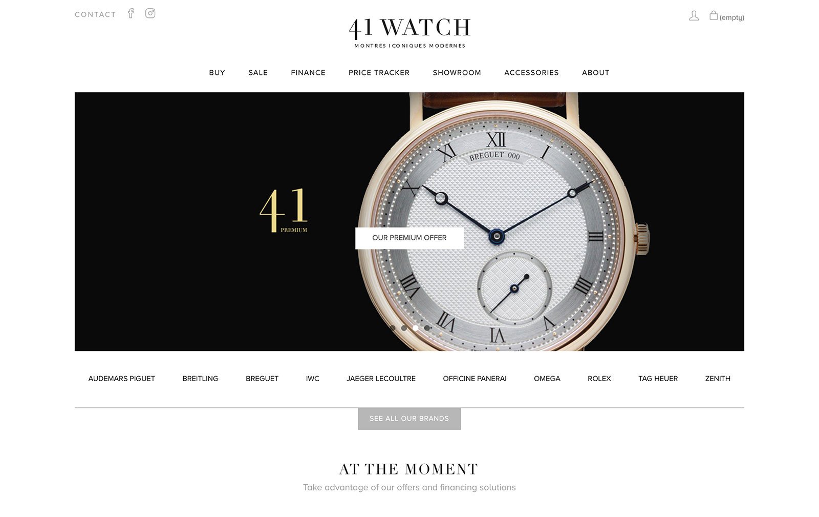
An elegant, clean-cut website that draws the viewer’s attention directly to the company’s products. There are no fancy gimmicks here—just a classic color scheme and a mix of serif and san serif fonts throughout the website that hint at a line of contemporary watch designs with a touch of the old world charm.
FiftyThree
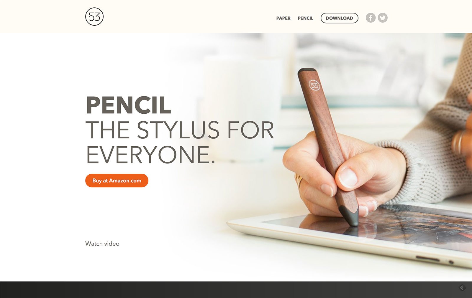
This company’s website aims at a sale right off the bat. The visuals of the product are large and stand out against the subdued background. There is also a direct link to the Amazon shopping page for the product, which is highlighted in a brighter orange color than the rest of the homepage in order to attract attention.
Aether Apparel
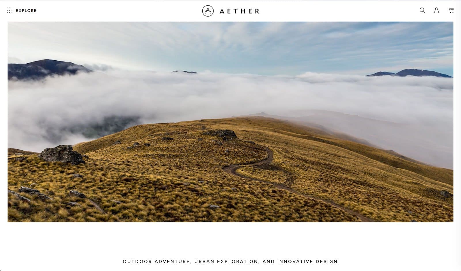
Notice the stunning visual of low-hanging clouds and a winding path that virtually leads you into the website itself—it’s hard not to! Consider how this image (which is actually a moving picture on their site) communicates what type of clothes Aether Apparel sells to their customers and what kind of interests they have that this image appeals to.
Allbirds
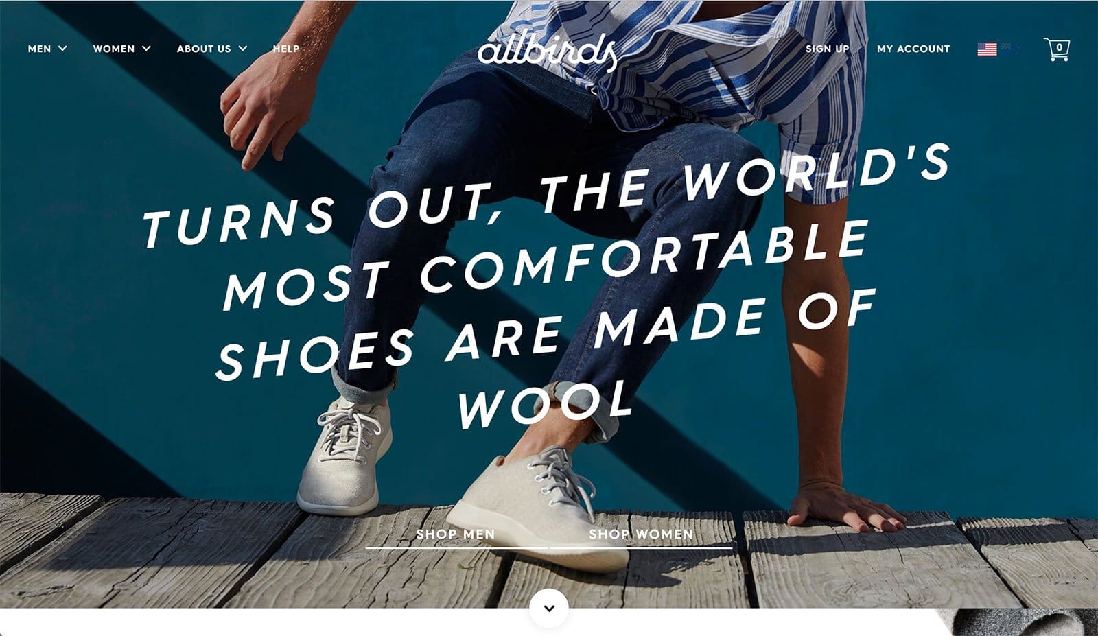
This website has a casual yet sleek feel to it, which is what the brand aims to promote its products as. It uses a brilliant mix of gifs, images, and illustrations along with videos to showcase the brand’s youthfulness. The playful vibe speaks to the kind of consumers they’re targeting—adventurous and active ones—and you can’t miss their unique value proposition that’s right in the center of the page in a large, clear font.
Bastide
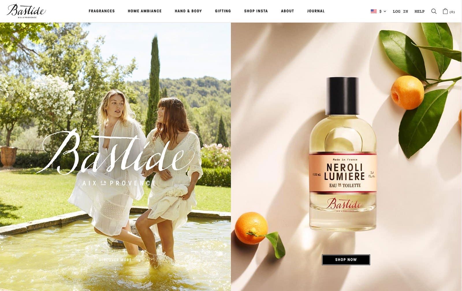
It can be challenging to sell products online that customers usually prefer to touch and smell before they buy, such as the fragrance, bath and both products Bastide sells. In order to help customers connect with the products through the screen, the brand creates a scene that tells a story about the product so customers can connect to that instead. The image on the left is known as a “lifestyle shot” where the product is shown in motion to communicate how the customer will feel or look when using the product, and the image on the right is a “product photo” that shows the actual product in detail to show off specifics like size, color, and branding.
BeardBrand

On Beardbrand’s homepage, they put a lifestyle shot front and center to communicate to their customers how their products look in action. On the focal image, they intelligently have placed a call to action, “What type of beardsman are you? Take Quiz.” to encourage visitors to interact with their site and ultimately, to encourage them to buy and try some of their products. Below the main lifestyle shot, but still “above the fold”, they include images of their merchandise, product photos and a snapshot of their tutorials to show visitors what other content their website has to offer.
Bellroy
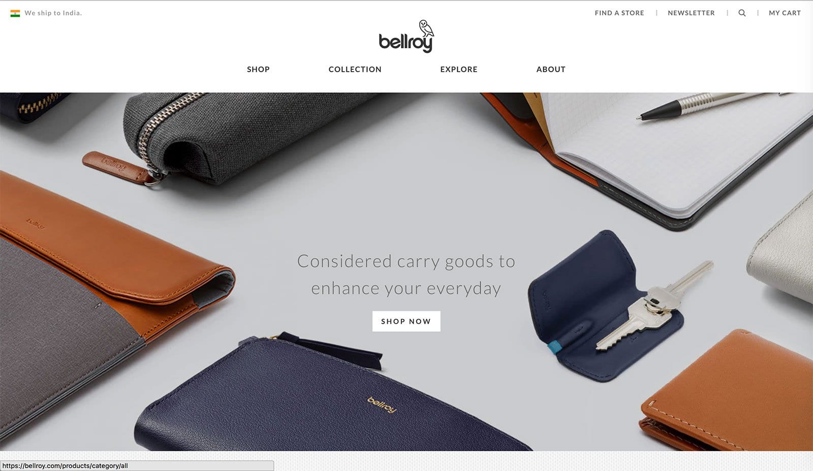
Bellroy’s minimalist and modern homepage image directly reflects the style of the brand’s products. They, too, have a strong call-to-action front and center encouraging visitors to “Shop Now,” for products they say will, “enhance their everyday”. Notice how they showcase the range of products they offer by giving a glimpse of them in every corner of the image leaving the center free for the call-to-action to be displayed.
Bill Blass
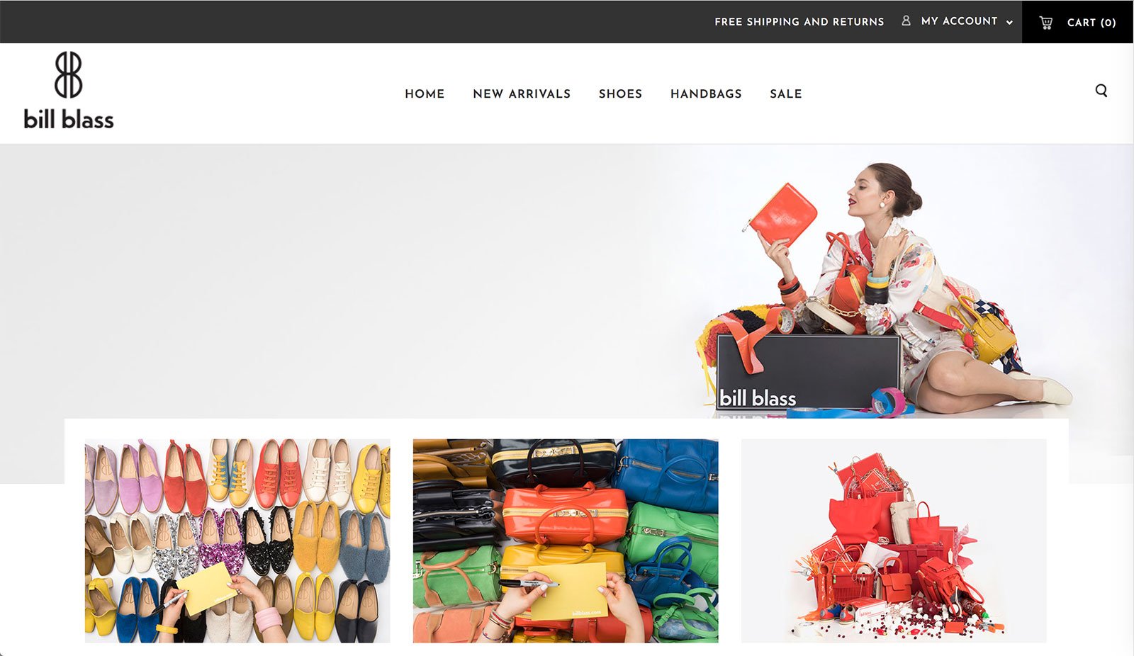
You can immediately tell which product Bill Blass sells based on the imagery they feature on their homepage. Notice their use of punchy, bright colors on an otherwise muted background and their lack of call-to-action. In their case, the images are their call to action and they let them guide customers to other pages on their website rather than written copy and “Shop Now,” or “Learn More,” buttons. A picture’s worth a thousand words and they let them do all the talking.
Caran D’ache
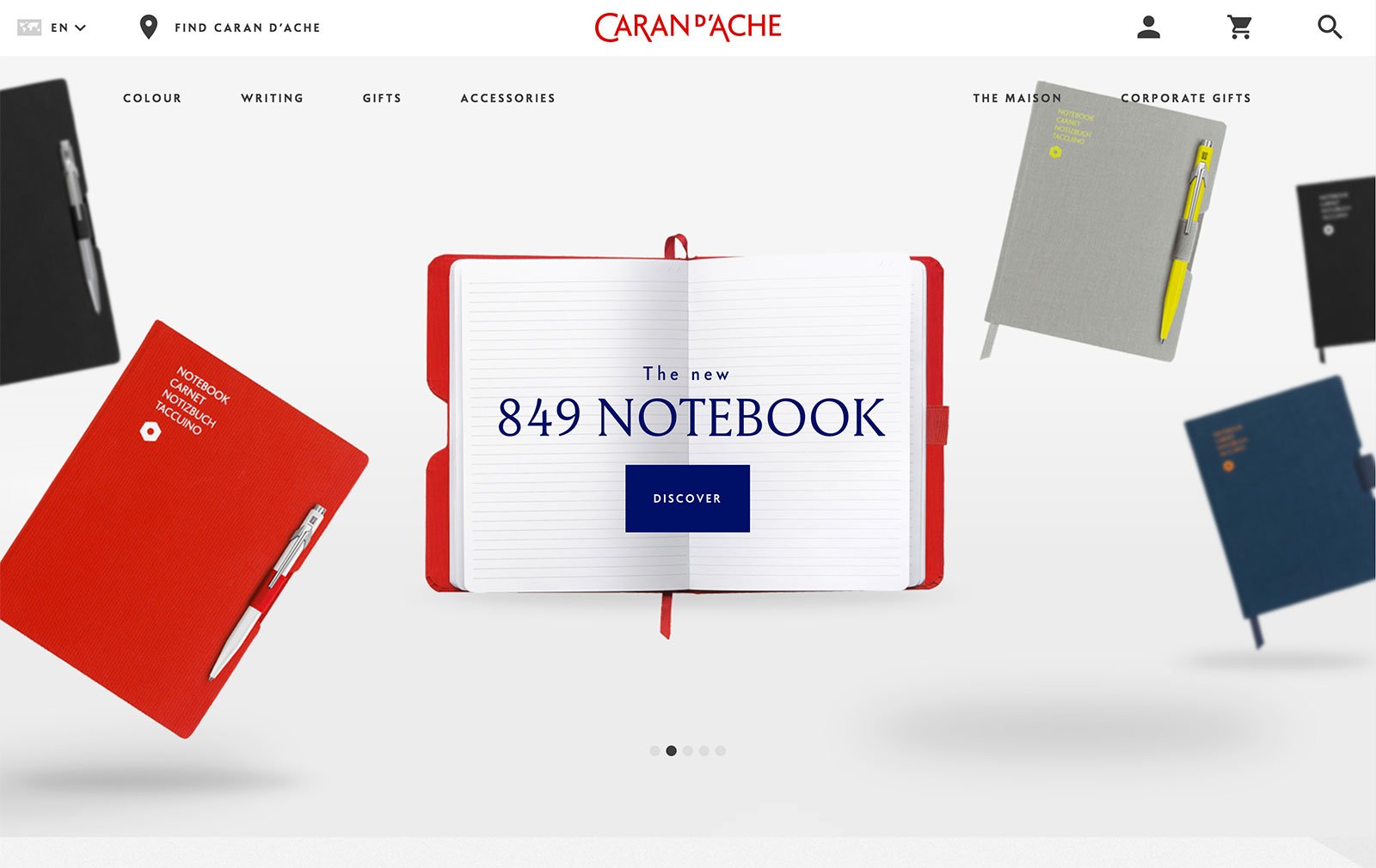
This website has a beautiful design with a playful feel to it. Both the typeface used for the logo as well as the product placement of the notebooks in this particular stylized product photo demonstrate the quirky personality of the brand. Note the call-to-action cleverly placed overtop the open notebook to make it look like it’s written inside it. Also, consider how they’ve made use of the bright pop of their red brand color to both frame the call-to-action and draw the eye up to the logo.
Chumbak
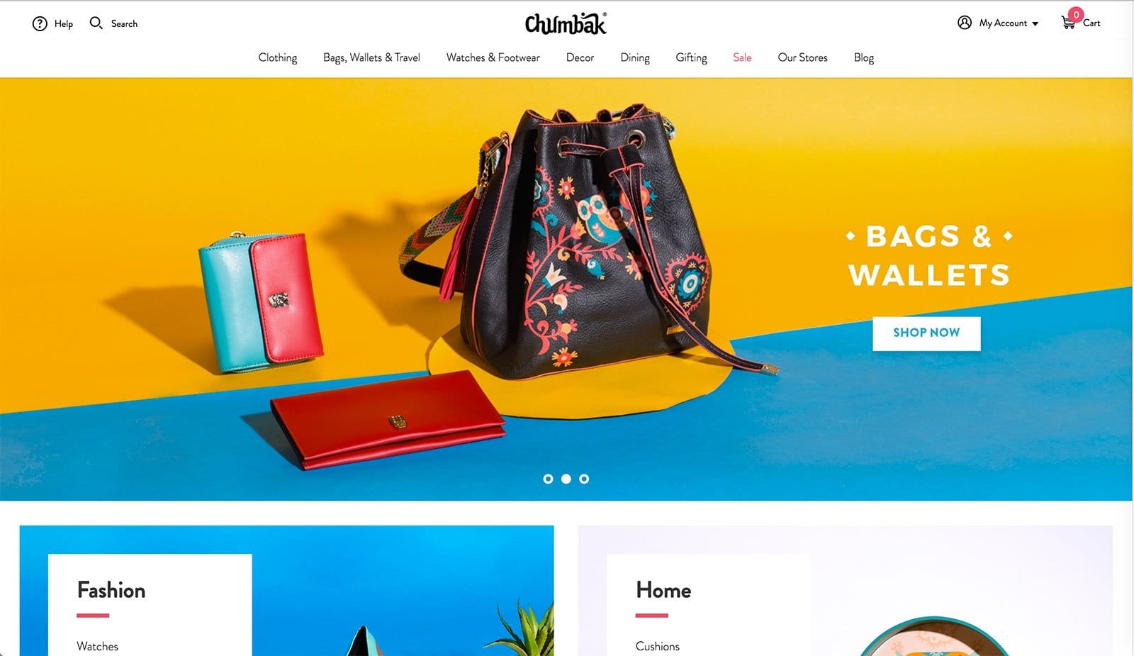
“Chumbak” literally translates to “magnet”—which is the exact effect that this website aims to produce. A mix of pop colors, GIFs, symmetrical and asymmetrical grids are used to showcase products—which play up the quirky persona of the brand. The colors, the products, and the website’s design definitely make it hard to take your eyes away.
Commander Deer
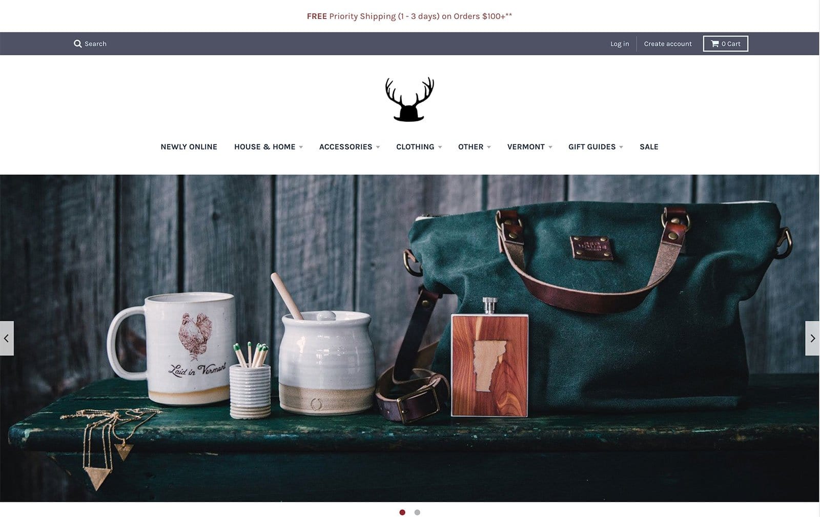
Almost everything—from the logo to the product photography—has a very western-rustic feel to it which plays into the brand’s identity as they produce and sell “American Made Goods”. They showcase lifestyle shots of the products in action in a rotating image carousel (see those two small dots underneath the image? Those indicate that there are two images on a slide show that changes every couple of seconds) so customers get to see as much of their product offering as quickly as possible. Also, note how they include information about their shipping right at the top of the page so customers don’t have to dig around their website for it.
Cord
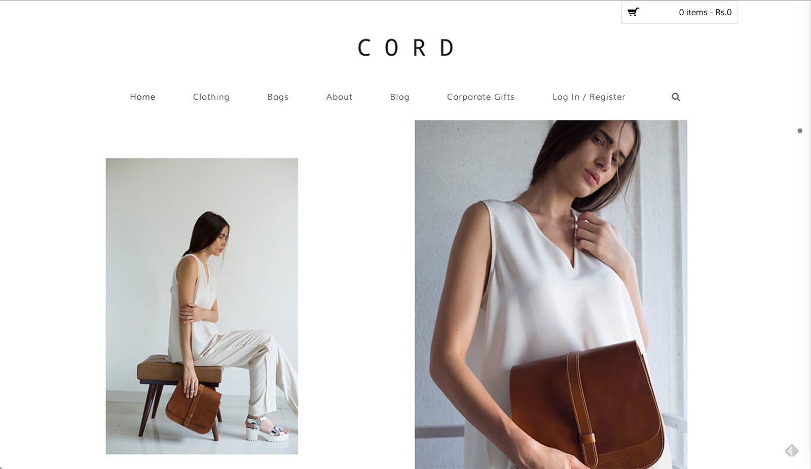
The company describes itself as “Modern + Classic: A radical core intertwined with non-standard elegance”—which is exactly what the website design reflects. It has the sleek design, artistically framed pictures with models and products like a high fashion magazine, asymmetrical photo grid placements and a mix of contemporary fonts to enhance the effect. The website gives off a cool, light and airy vibe to it while the models and products exude a certain confidence about them.
Death Wish Coffee Co.
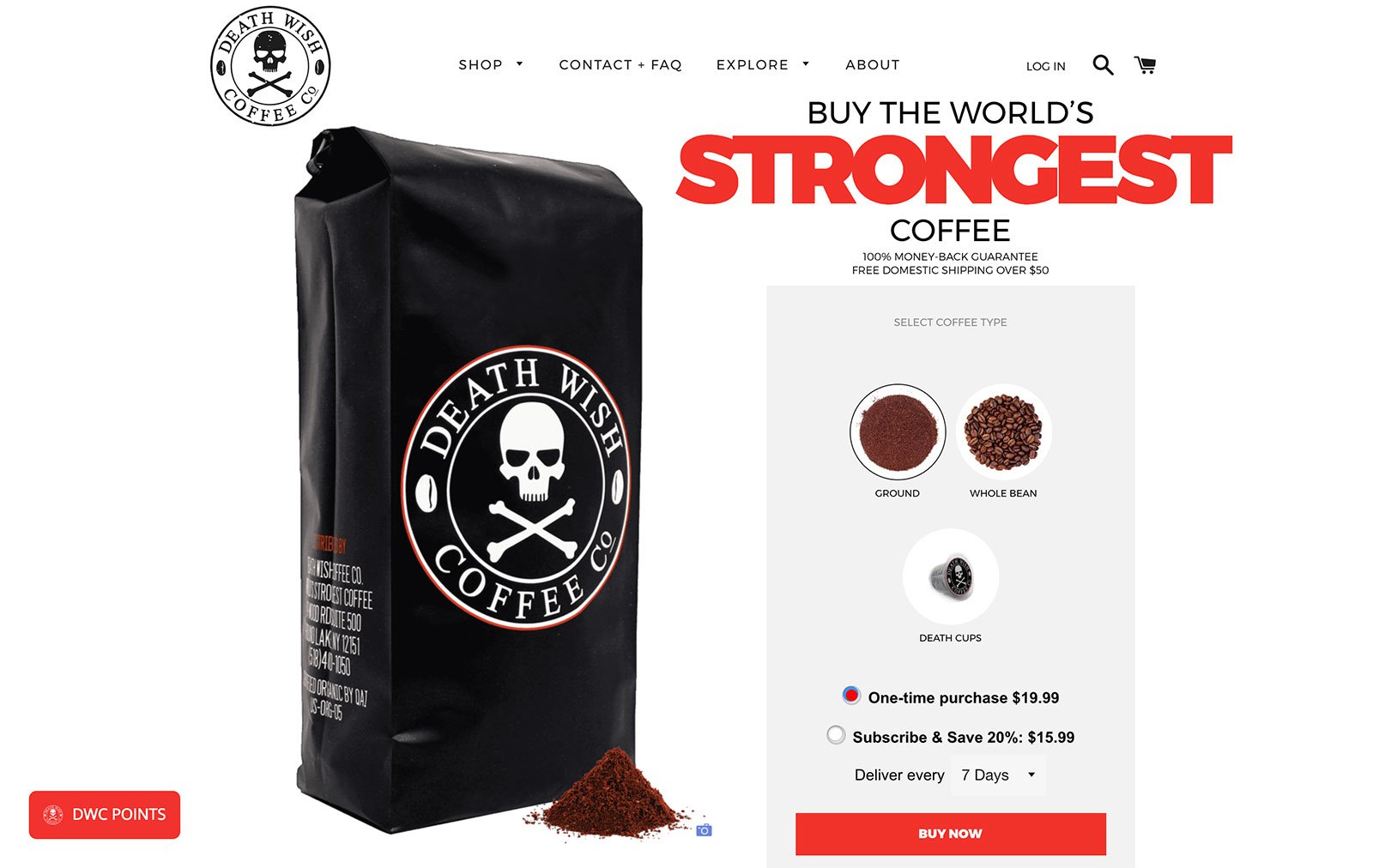
The website for Death Wish Coffee Co. embodies the company’s spirit. The website claims that their brand of coffee is the strongest in the world due to its unique blend and roasting technique, while also being smooth to taste. The web design is robust and uses colors like red, large bold letters, and imagery that is consistent with the brand name and logo. Due to the product being one of the focal points of the entire business, the homepage opens to a large image of it with an option to buy/subscribe to it. There is no lag in getting to the product page, which makes this a very “in-your-face” approach, but it suits the brand very much and definitely works for them. Additionally, the black, white & red color scheme is classic and complements the product packaging theme as well.
Di Bruno Bros.
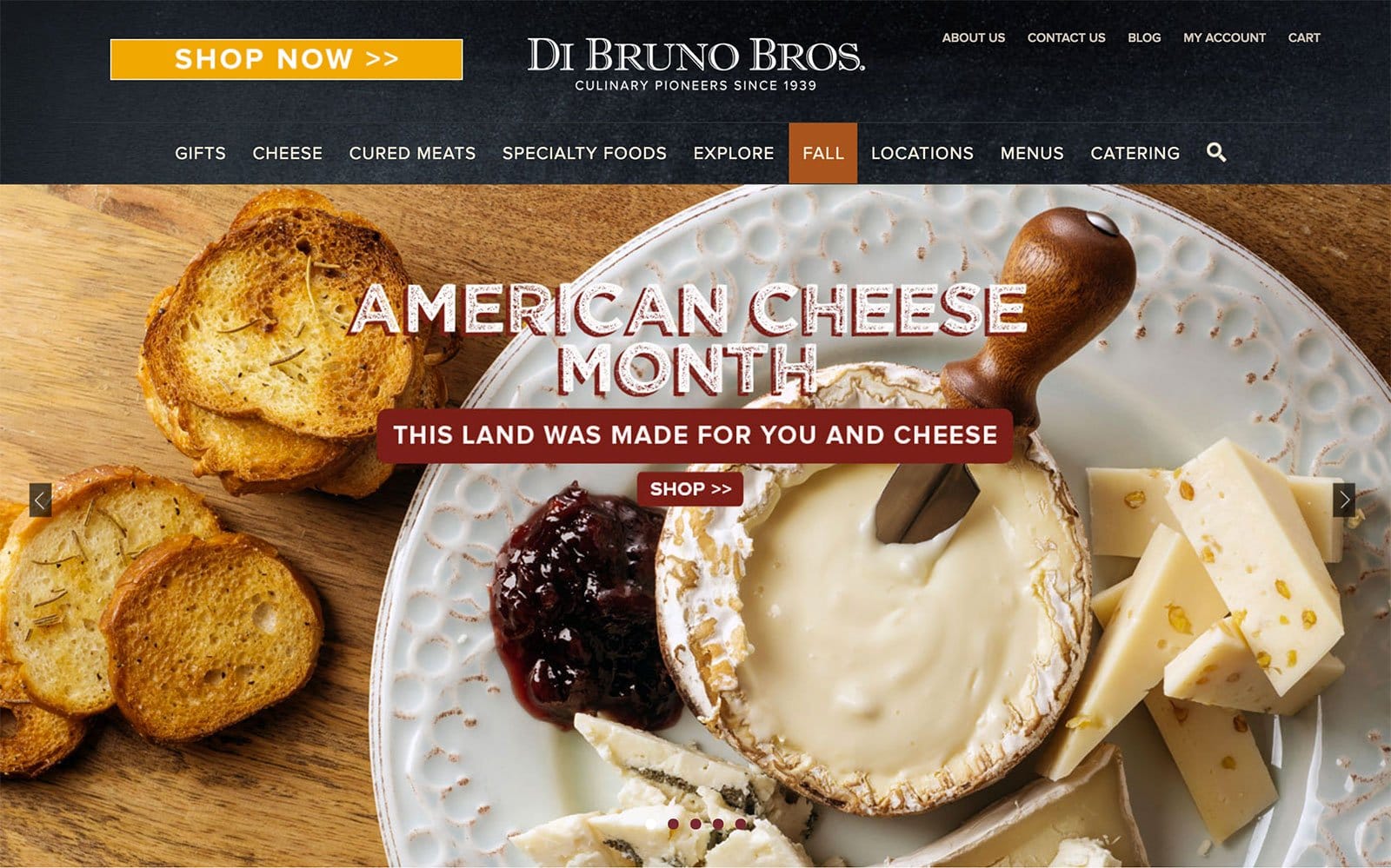
Di Bruno Bros website opens to large scale images of some mouthwatering spreads, cheese, and bread that rotate through a carousel. The presentation in the pictures is impeccable and adds to the rustic feel of the brand and its website. The background of the banner almost looks like a chalkboard and adds to the charm. The basic linear navigation and use of subdued colors in the website theme ensures that the product photos do all the talking like they rightfully should.
Drybar
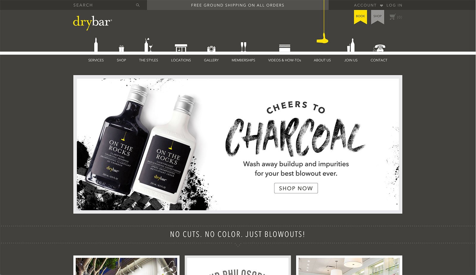
The Drybar website opts for an inverted greyscale color theme with pops of yellow to keep its look stylish and model—much like the brand. While not a typical ecommerce store, the website still maintains the classic format of one. The little white silhouettes above each menu option are a lovely touch to the otherwise simple website and give it a little extra style. Notice the clear call-to-action front and center that pops against the grey backdrop and their unique value proposition displayed right beneath it.
Fangio
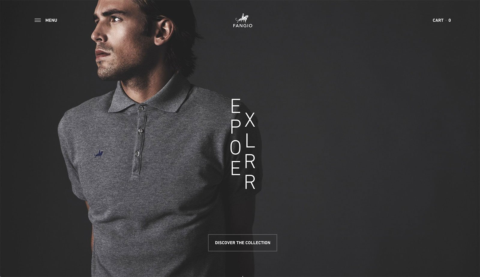
Using Fangio’s website is a unique experience altogether. Right from the little details on the buffering page to the “choose your language page” that plays a little black-and-white classic looking montage of cars and bikes that are reminiscent of the 50s—everything about the site makes the visitor want to explore it a little further. This website truly uses HTML5’s advanced multimedia features to its fullest potential. The way the products are presented, the linear navigation that feels different than any other website, the little details that are revealed every time the user explores another part of the website—they all go a long way in providing a fantastic user experience.
Flambette
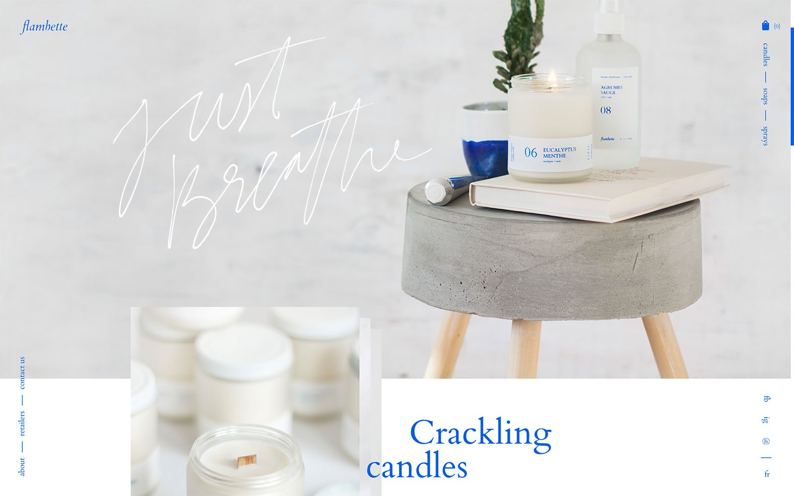
This website has a lot of little quirks that really grab the user’s attention—from the slight movements of the words to the product carousel being a part of each picture frame that changes only when the user scrolls. The menu options stay perpetually on the right-hand side as the user scrolls, which is useful to jump to other pages from anywhere on the home page. These smaller features make a big difference in user experience.
G-uld
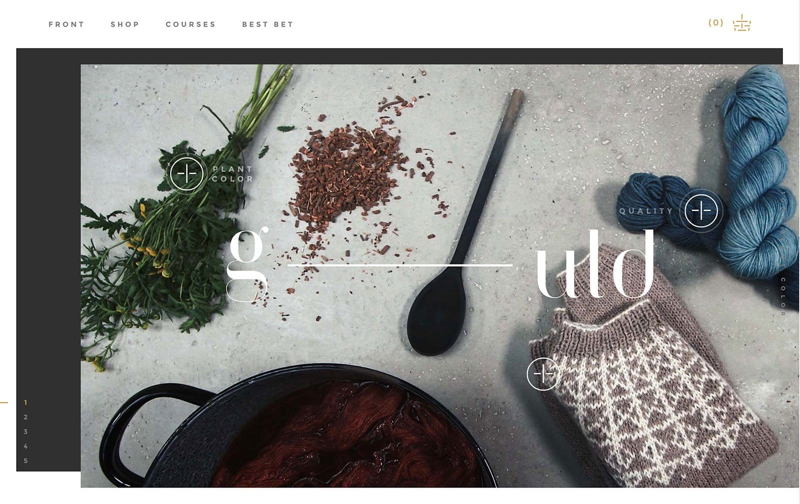
Yet another visually stunning, dynamic and interactive website, this Danish brand’s website design does all the talking for it. The home page opens to a flat lay picture that has a slight movement when the cursor hovers over it. Each element of the picture transitions to include a pop-up description of the product when cursor scrolls by which is an interactive UI feature that brilliantly achieves the feel of immersive storytelling. Coupling the finished products beside the raw materials in the image plus informative pop-up descriptions and the beautiful ecommerce website design, it shows off the brand’s authenticity and very likely appeals to their target market’s tastes.
Glitty
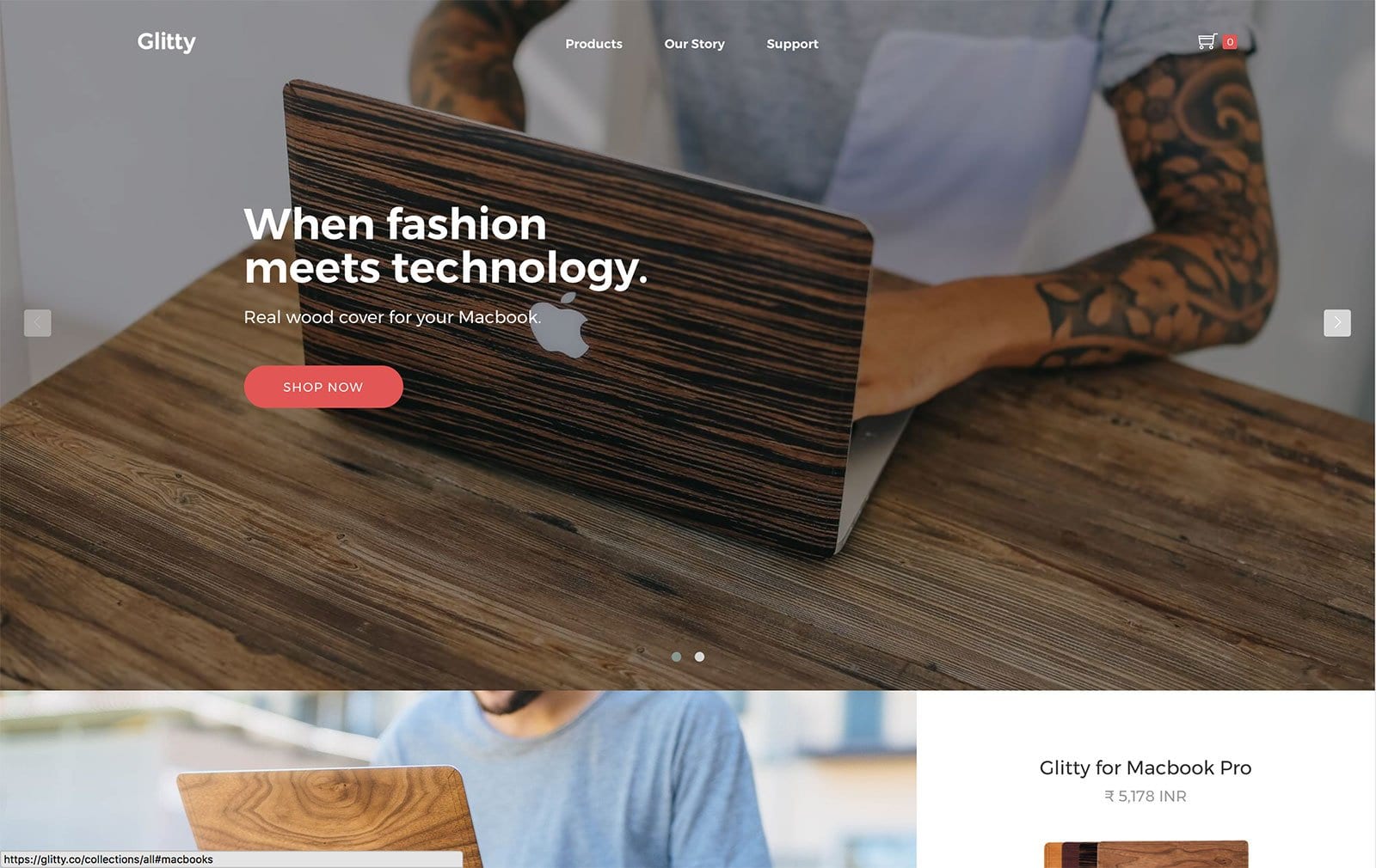
A full-page product carousel with bright and bold text and a strong “Shop Now” call-to-action, this is a classic, fail-proof ecommerce website format. That, along with some well-shot pictures of the brand’s product integrated into everyday life, this website design is bound to grab some eyeballs. The pictures are placed in a mosaic grid-like format on the homepage and highlight the finishing of the product. Even the models, who are representing the brand in these photos, give off an urban, stylish and young vibe—which is likely very similar to the company’s target market.
Greats
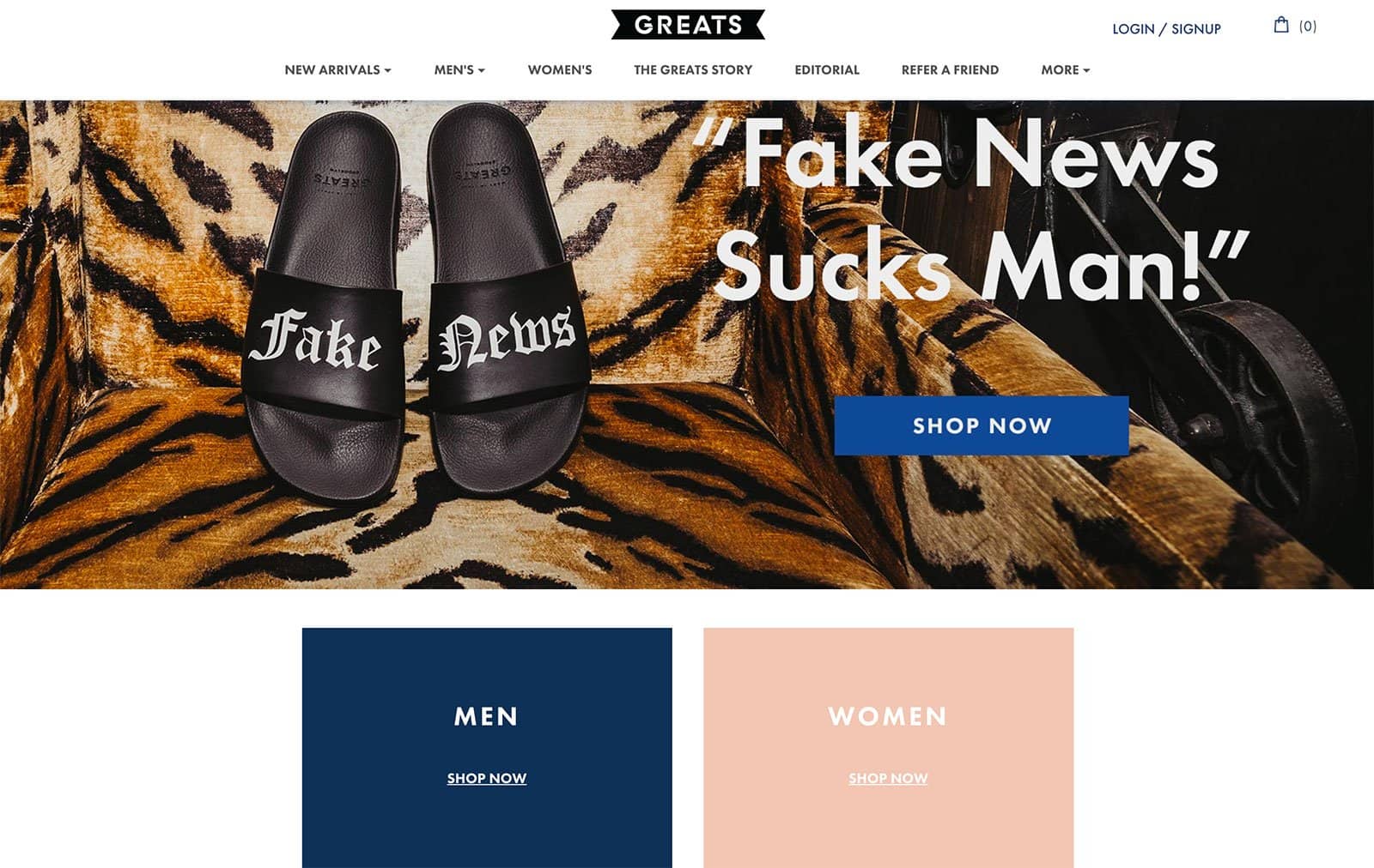
The home page opens with a quirky message that’s likely to grab the attention of visitors and appeal to their target market. The quirky copy reflects the fun nature of the brand and the types of products you’ll find there—fun and quirky ones. Their calls-to-action are prominently placed on the page, with one at the center of the page for the promoted product, plus collection pages for both men and women clearly placed directly below.
Grovemade
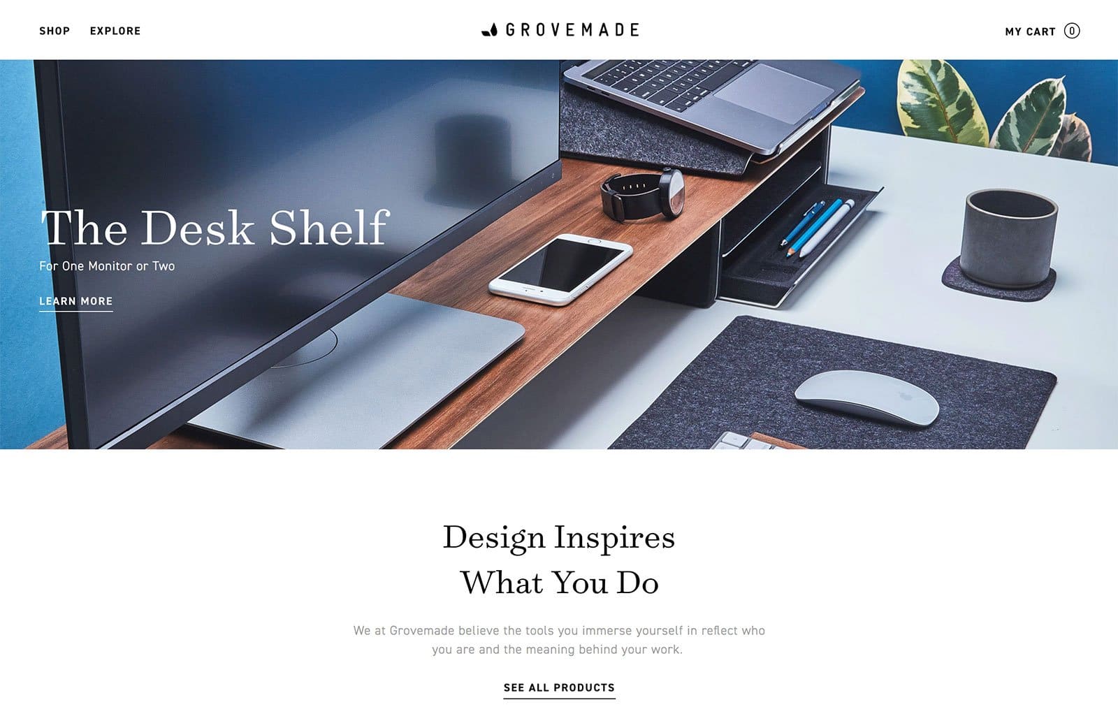
The company really believes in design and finding inspiration everywhere. The website reflects just that. The home page opens to a beautifully curated picture of a desk (the product). Scrolling down shows you more pictures of stunning flatlays and other products, a video explaining the company’s process and beliefs, and the most interesting part—a “wall” of seemingly normal pictures of the entire team. When the cursor hovers over the images, they reveal a quirky picture of the same person that makes you want to know more about what’s going on—so when you do click on the image of a person, you get the role, a funny/interesting personality trait of the person and probably an anecdote to go with it. Integrating this feature into the web design truly makes the viewer feel like they know the brand a little more and it helps make that instant connection. A great strategy!
Haikure
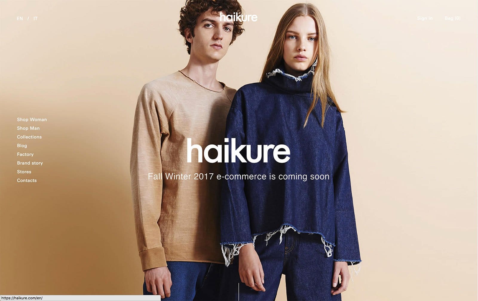
Haikur’s website relies heavily on visuals rather than text. The home page opens to a full-screen image of models wearing the products and as you scroll down, the image changes to an even more prominent, full screen one. It’s visually impressive and demand’s the visitor’s undivided attention to the product.
Happy Maps
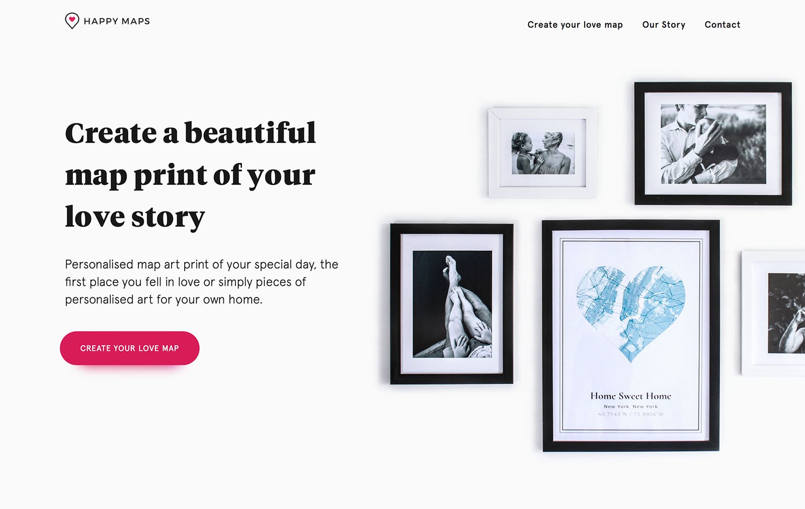
The home page for Happy Prints is designed to make you feel nostalgic about moments dear to you. The text and language of the site invoke memories that you would love to capture in their product. The design itself is very engaging—the text and pictures don’t just load but appear through beautiful transitions as the user scrolls through the homepage. The examples of the personalized products and the way they can be framed and presented in the user’s personal space is quite attractive. The muted black, white and pastel shades on the homepage allow the brightly colored call-to-action, “Create Your Own,” to stand out.
Heaven Sake
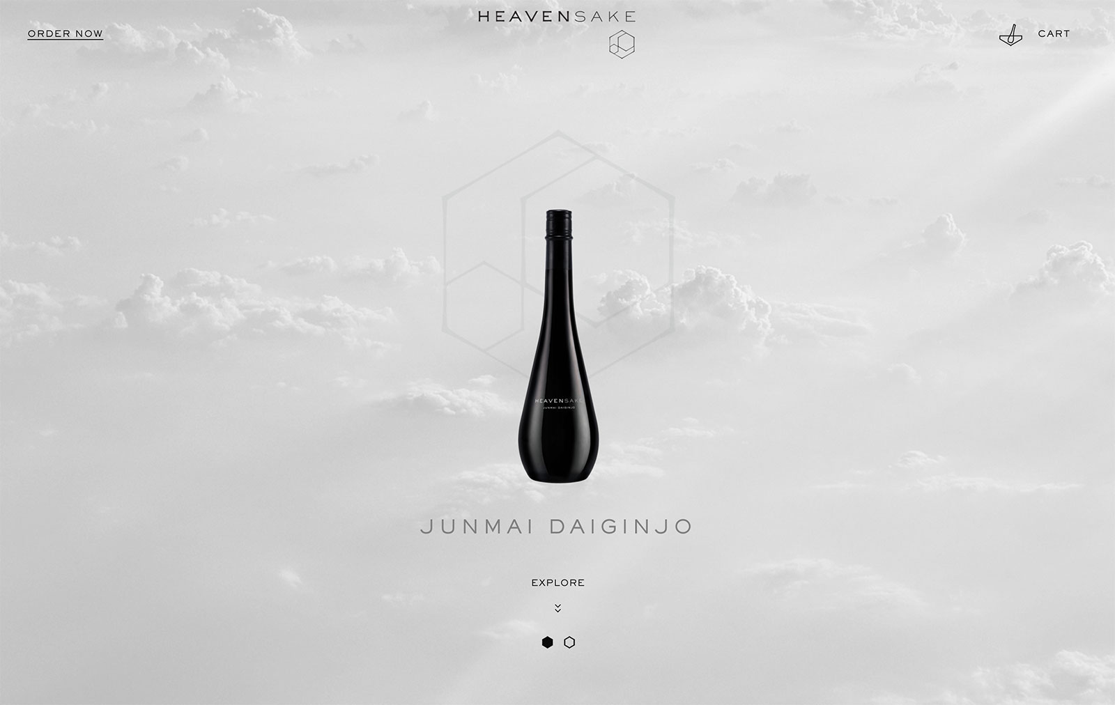
This website design is both visually stunning and unique. The product itself is very well designed and the company’s website just elevates the brand. Due to the nature of the company (it only sells two exclusive products) they have really enhanced the user experience by indulging the viewer with an interactive UI. What truly stands out is the fact that the entire website is just one page—no links to other web pages (except at the footer—the standard privacy policy, terms, and conditions, etc.). The juxtaposition of the product itself, which is an alcoholic beverage, the way the product is branded as the world’s purest alcoholic drink, and the ethereal look of the website is extremely captivating. The website encapsulates the tradition of the Japanese Sake and the high fashion consumers it targets very creatively.
Helm
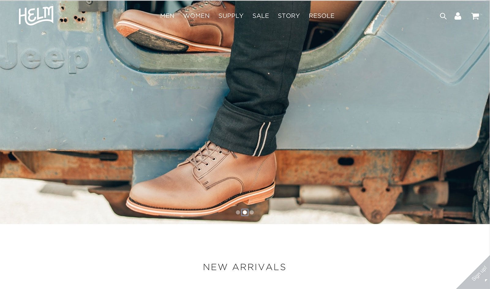
The company proudly boasts that it caters to “hipsters” and that’s exactly what was kept in mind while designing the ecommerce website. The warm colors, the image carousel featuring outdoorsy pictures of the product as well the product juxtaposed in an urban setting, gives the website an offbeat yet nostalgic feel. The website constantly reaffirms the brand’s identity, although subtly. As the company caters more to men, the website also leans toward a more rugged appeal. The company stresses the importance of craftsmanship when it comes to their products, which they reflect through the design of the website as well.
Ikka Dukka
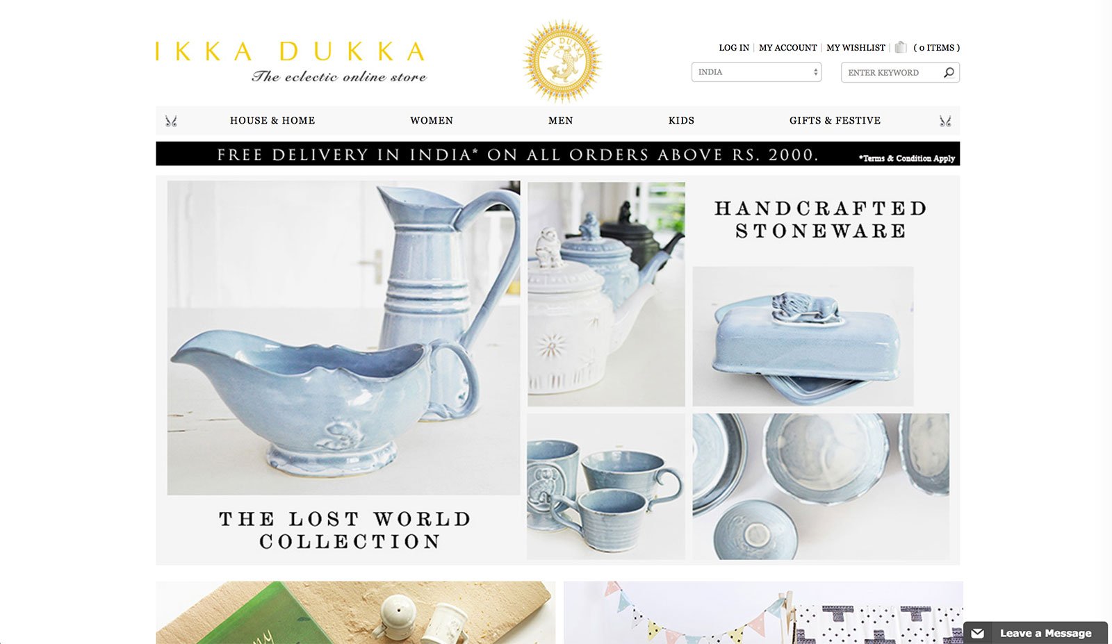
Ikka Dukka’s website isn’t as fancy as many other websites on this list, however, the reason it still belongs here is due to its superb product photography. Be it for a stand-alone product or a collection, the images truly make the entire aesthetic appeal of the website. It’s a standard ecommerce website by all other means, but the photos spin all the magic.
Jack Erwin
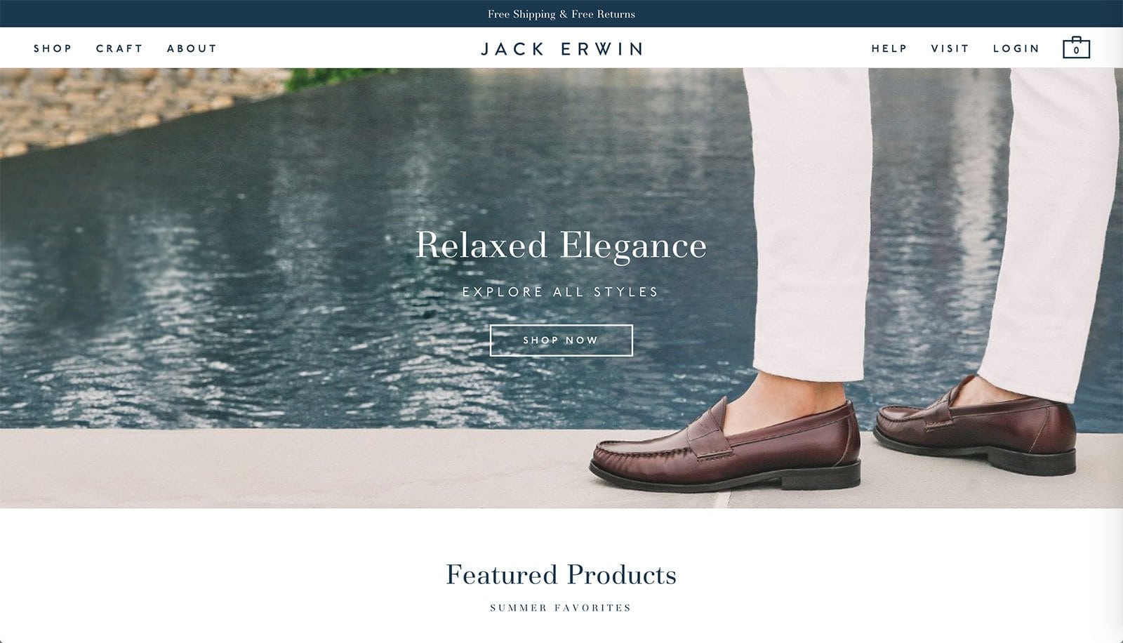
This website is designed to cater to the modern gentleman. The font is classic and clean, the lines and grids are straight and symmetrical, the colors are muted and the products are the focus of the website. The brand aims to create high quality and thoughtfully designed products, which is exactly what the website reflects. This is a great example of a well-designed site that focuses on catering to its niche.
JM & Sons
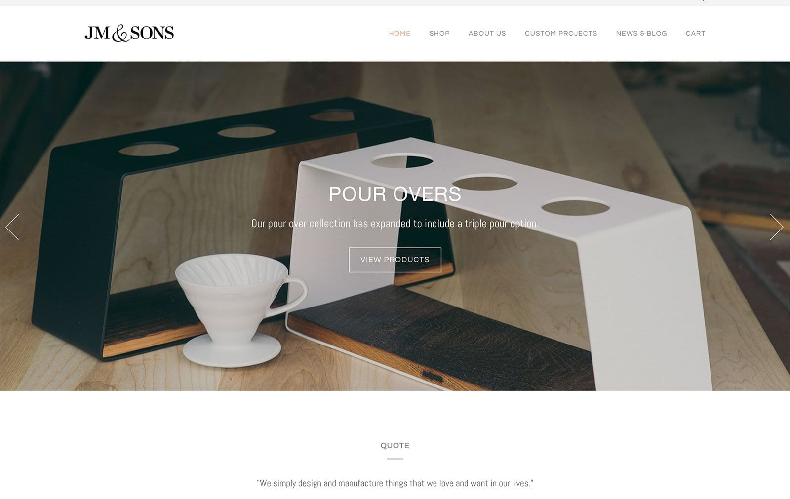
This company creates products that are a result of woodworking and product design. The website definitely reflects both of these aspects. There is a certain degree of craftsmanship and tradition that the user is faced with as soon they open the website. There is a mixture of classic product photos along with some candid photos of the work the company exhibits, as well as their ambassadors.
John Dalia
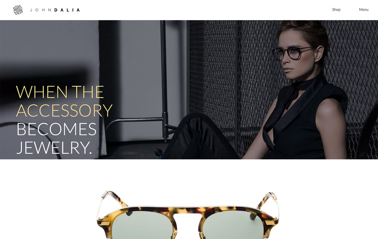
A high fashion brand that is worn by celebrities, John Dalia’s website is nothing less than highly fashionable either. The homepage opens to a lifestyle shot of the model wearing the luxury eyewear, but when the user scrolls down, they are greeted with an interesting mix of backgrounds and foregrounds, as information and images are layered over each other. This ecommerce website presents an innovative way of showcasing the products by themselves while also giving featuring them in context.
Karmic Cold Pressed Juice
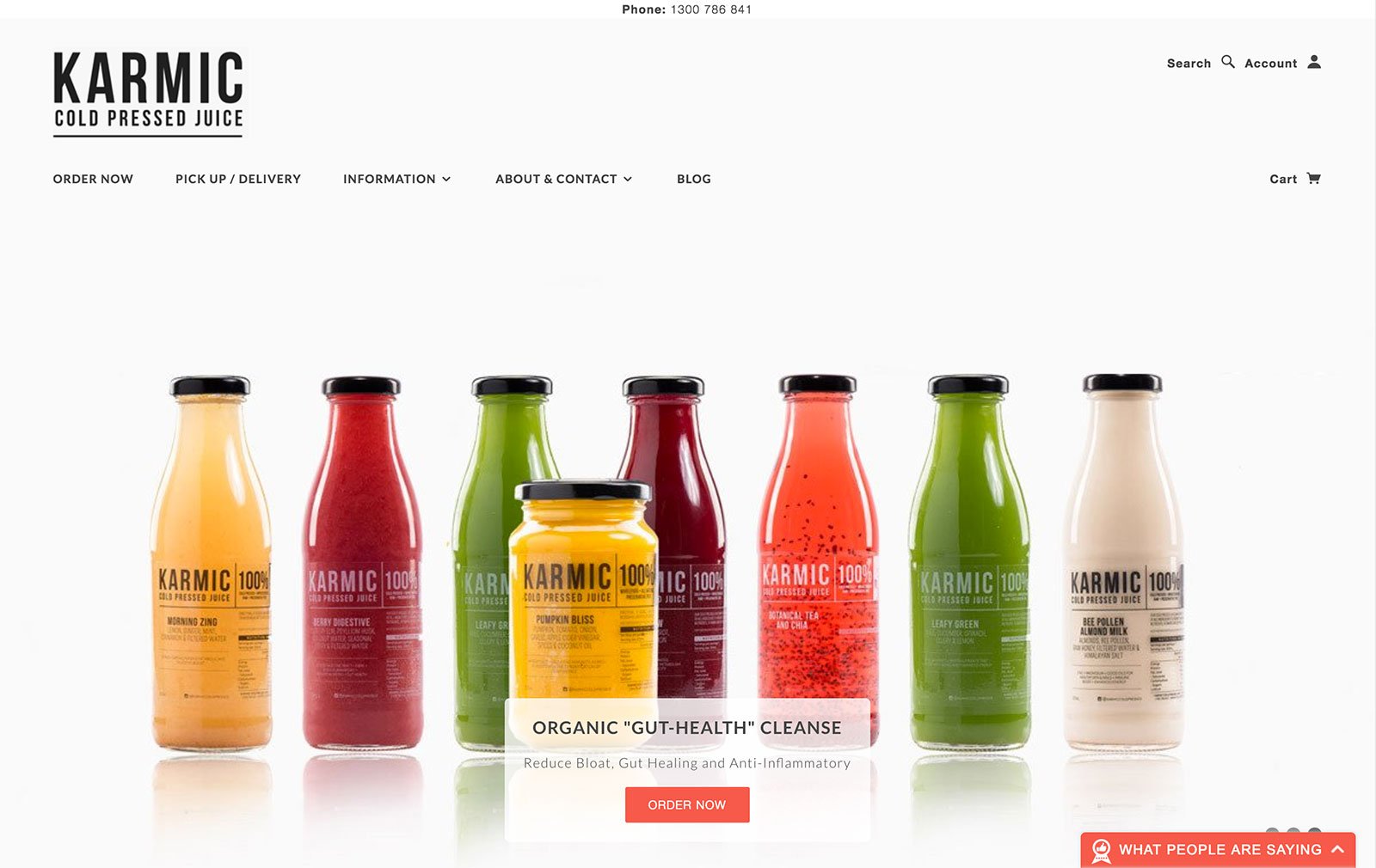
Karmic Cold Pressed Juices’ ecommerce website is vibrant and alive with color, and they allow the majority of the color to come from the product itself. The array of colors depicted by the range of juices gives the website a fresh feel, which reflects the fresh nature of the products. The font remains consistent throughout the website and apart from the product pictures and social media images, the website leans more towards text. The website is designed to keep in mind that there is a lot of information about the products that the customers are interested to know so there’s no fancy transitions or multimedia integrations—the focus is all on the products.
L.Novum
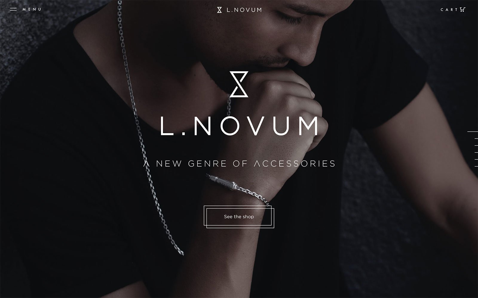
This company describes its products as being meticulously crafted, and their website is no different. Their products cater to men and so does the theme of their website—dark colors, primarily black and grey, carefully curated and selected product pictures, some great motion, and graphics—all add to the persona of the website and the identity of the brand. The linear navigation brings a new full-screen image or large text on screen while scrolling, thus maintaining focus on small chunks of information that are easy to absorb. Another great example of a well built HTML5 site, using the advantage of multimedia integrations.
Lane
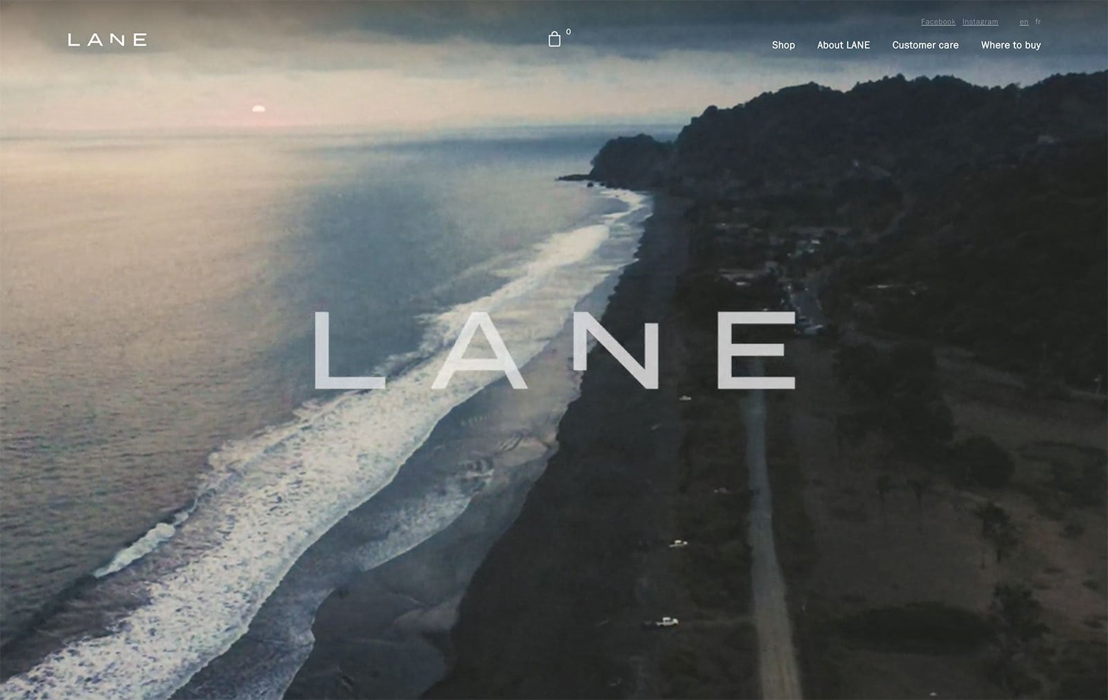
The website for Wear Lane is heavily influenced by the ocean currents, street style, and active lifestyles, and they produce swimwear for men which is perfect for all occasions. The website is exquisite with a mix of full-screen multimedia and fantastic imagery—the products are presented well and the colors are muted to make the text and product photos stand out. Navigation is simple and the cutting edge website is scattered with information—a great ecommerce website overall.
Langly
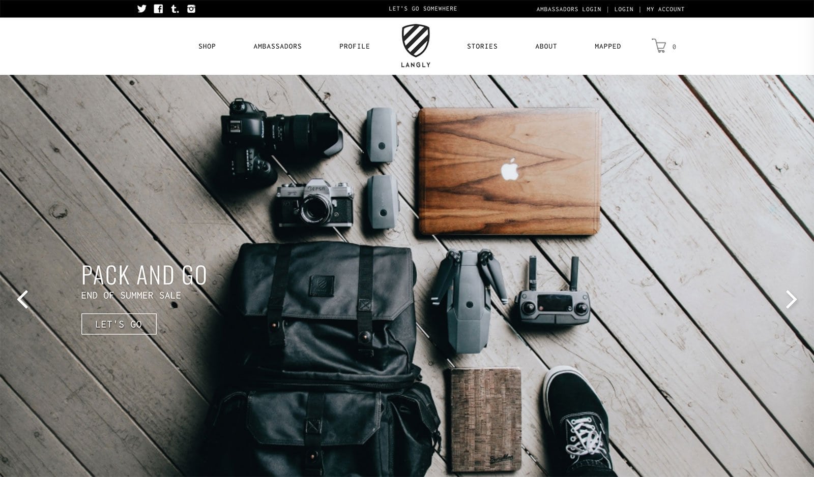
Langly specializes in camera bags that are fashionable and functional and is made for adventurers and travelers, therefore the website is heavily influenced by this. The homepage opens up to some beautifully photographed images that are described as “Pack and Go” and “Adventure Begins Here”, etc. There are slight transitions and the homepage seems to be layered over other images. All in all, the website’s design relies on the beautiful imagery and illustrations of products, enhancing the feel of it.
Leather Head
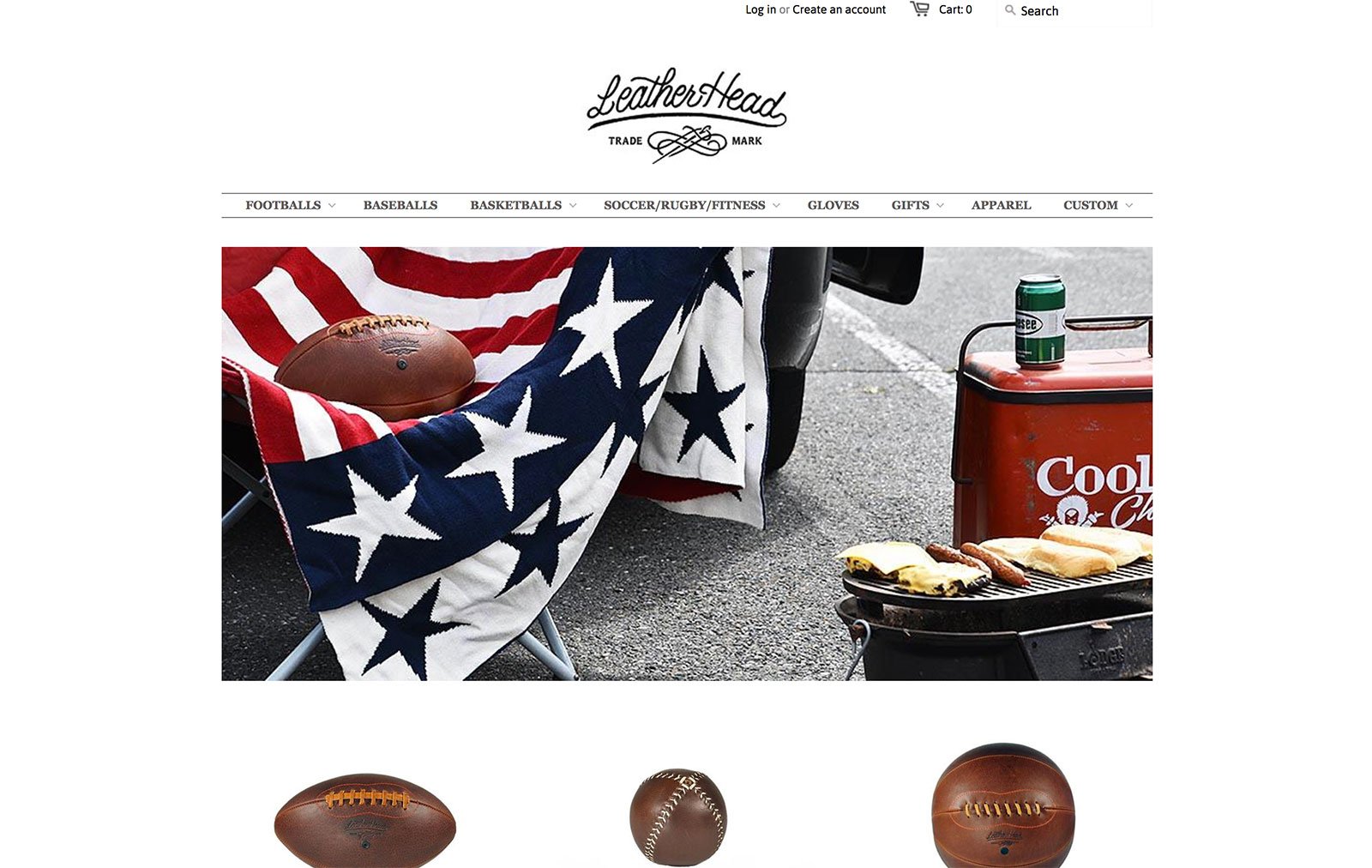
A company that specializes in handmade leather sports goods, Leather Head has designed the website in such a way that their products do not clash with the theme, thus it’s kept to a minimal black and white color scheme and enhanced with beautiful imagery. The website has a classic, “All-American” look to it which complements the look of their products.
Leif
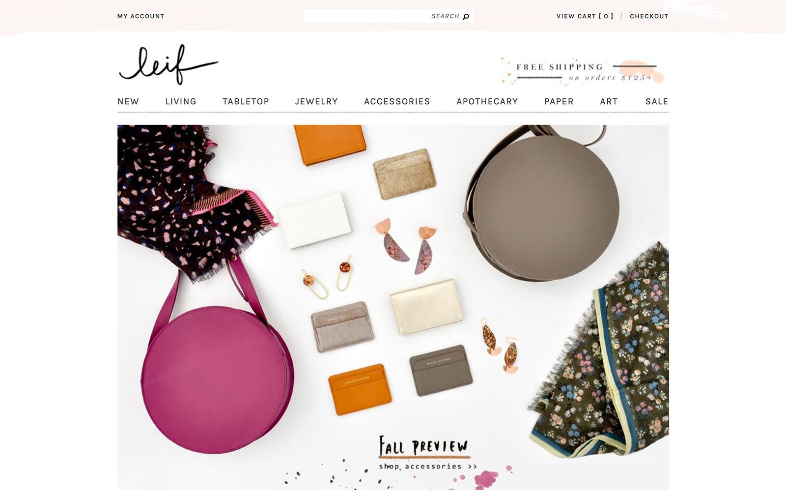
Pastel watercolor brush strokes make up the header and the footer of Leif’s ecommerce website. Muted colors highlight the dainty font and give the website a delicate feel. In contrast, the product photos are bolder; they truly stand out and draw the user’s eye to them. The handwritten logo style and banners give a personalized feel to the web design. This website is beautifully simple yet eye-catching.
LivSo
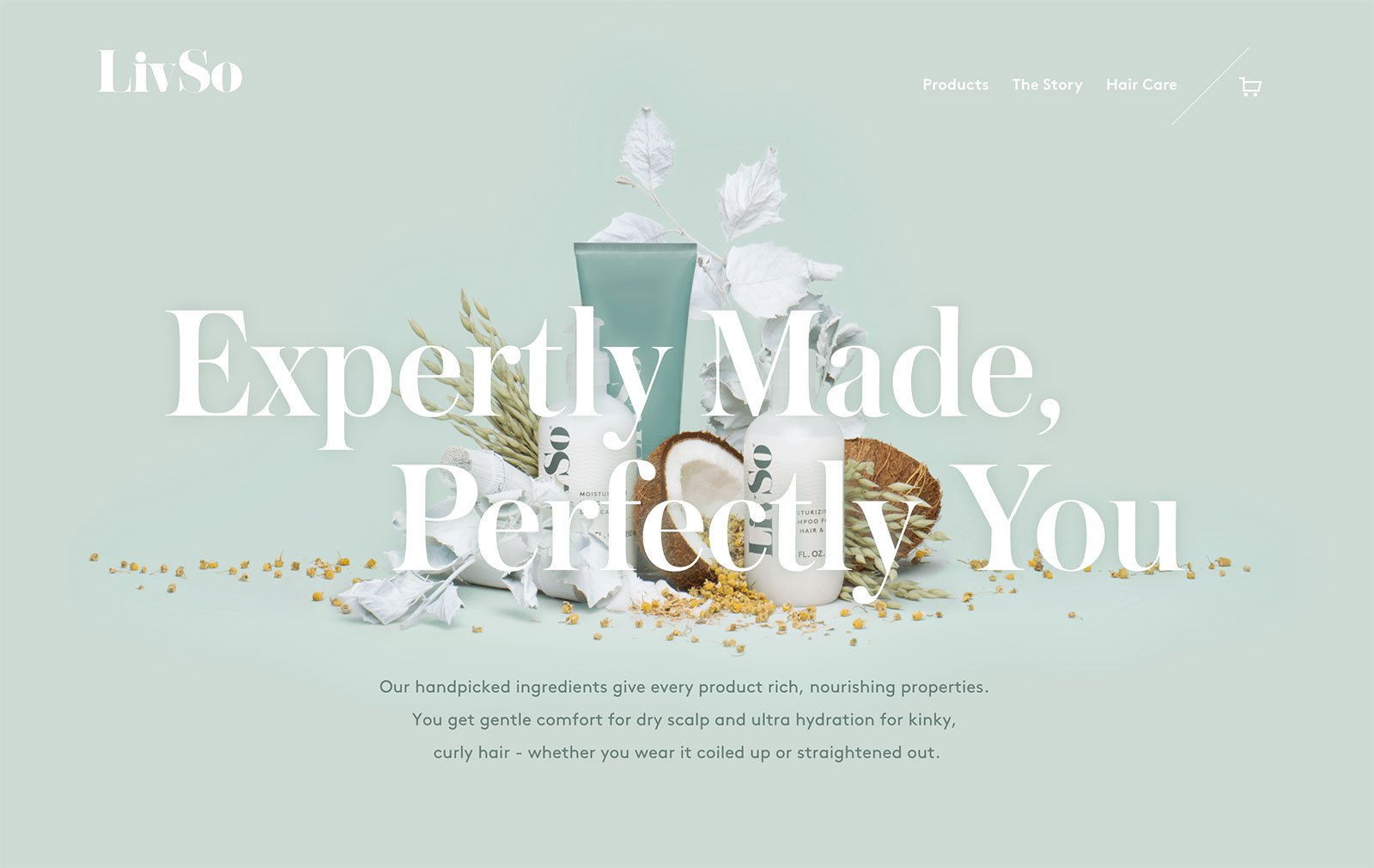
LivSo’s website is simple, delicate and gorgeous! The color scheme bends towards pastels and subdued tones which reflects the same choices made for the product packaging. The image that first greets the visitor is of the product and the ingredients that they are made of, which is pleasant to the eye. Simple navigation, large product images, and a boldly displayed user proposition value make this an effective and aesthetically appealing website.
Collage Crafting
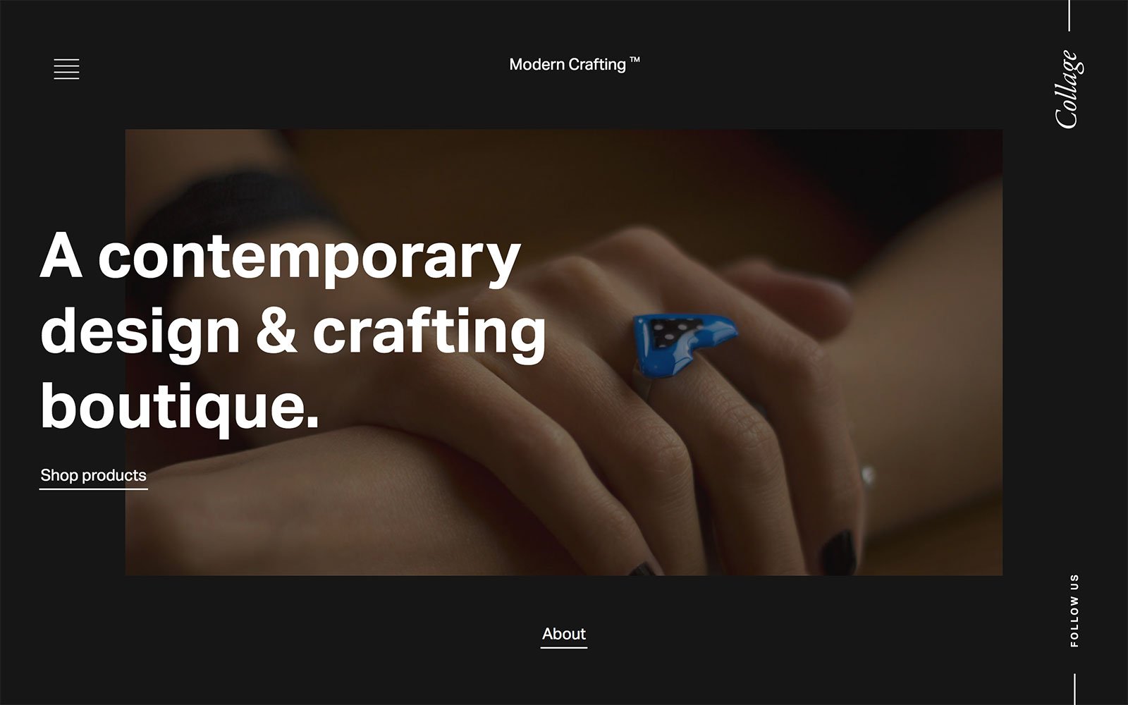
This is one of the more innovative web designs on this list. Elements keep morphing, pictures are fluid and the color of the product photos stand out against the black background and white text of the website when the cursor hovers over it. The site definitely wants to engage the user and make the experience stand out amongst the other billions of websites out there. Even the transitions to the different web pages are so unique that exploring the different products just seems more interesting!
Nameless
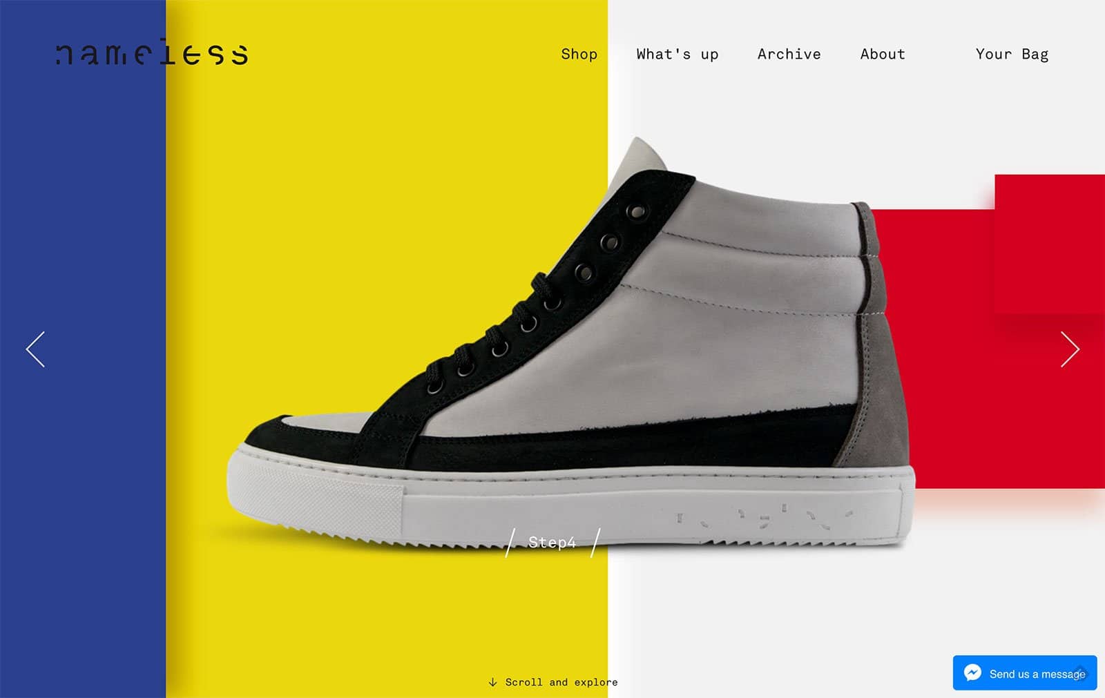
This company’s website is one of the most attractive and vibrant on this list. Nameless is an Italian shoe company that sells concepts rather than the brand name. Just like the company is aimed towards those who want to express themselves and their personality, the website also expresses the brand’s personality through bold colors, designs, and asymmetrical photo grids. A mix of quirk, style, and strong company ethos reflects very clearly through the website’s design.
Nappa Dori
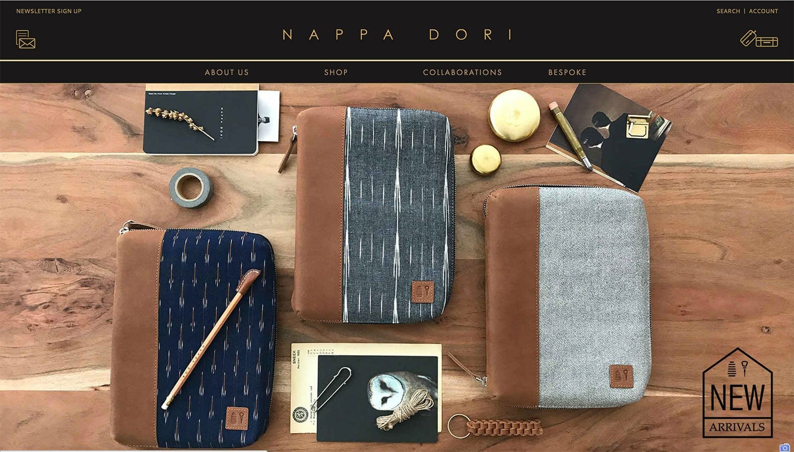
Nappa Dori brands themselves as a “tribute to the quintessential Indian sensibilities” which is blended perfectly with contemporary interpretations in design. Their website reflects the mysticism and romance of the vibrant culture the brand is inspired by. The beautiful products are portrayed through stunning visual imagery that highlights the craftsmanship and eclectic modernism. The ecommerce website incorporates many different aspects such as collaborations, social media integrations and the various collections on sale. A beautifully designed website for the modern romantic.
Pan Africa
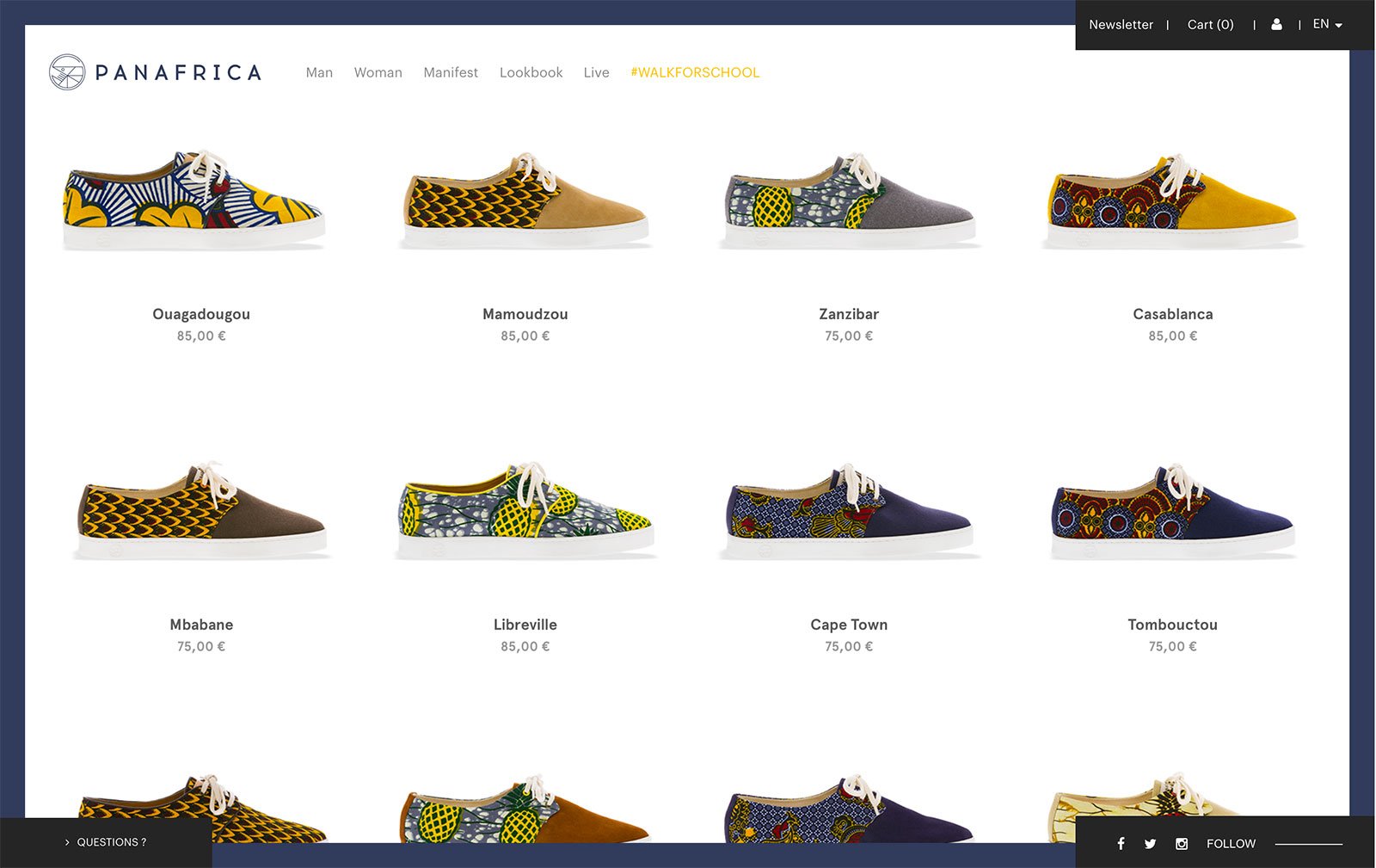
This website’s design is incredibly unique. The homepage opens up directly to the product display page and the products are all named after different countries from the continent of Africa. Each product is also made from materials sourced from the country that it’s named after, therefore the designs are culturally influenced and have some vivid patterns. The “Manifest” section of the website has a linear navigation with an interesting map-like structure on the left of the page that shows how much of the page has been completed. This is an extremely refreshing website design with an interesting product concept.
Paolita
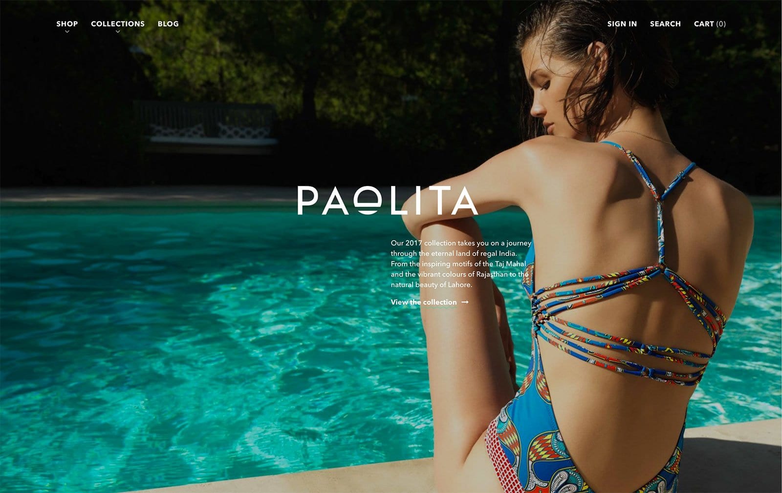
Paolita is a brand that has products with a lot of character and cultural influence. The swimwear label incorporates designs and colors from various different countries that the designer finds inspiring which is why the website has been designed in order to make these statement pieces stand out. High fashion photos of the product worn by beautiful models is a surefire way to attract attention to the products, but that along with the dynamic movement of the photo grids and the well-placed text is a great aspect of the web design.
Patagonia Provisions
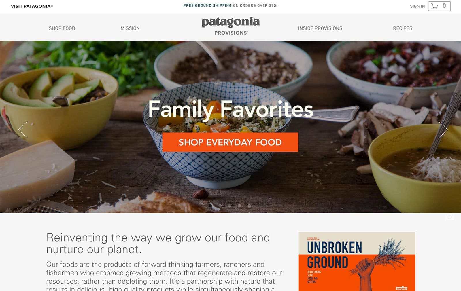
This may seem like a typical ecommerce website full of lots of information, however, it’s the placement of the text along with the images that make the website’s design effective. These attributes, along with the call-to-action, help pack a punch for the brand.
Pipsnacks LLC
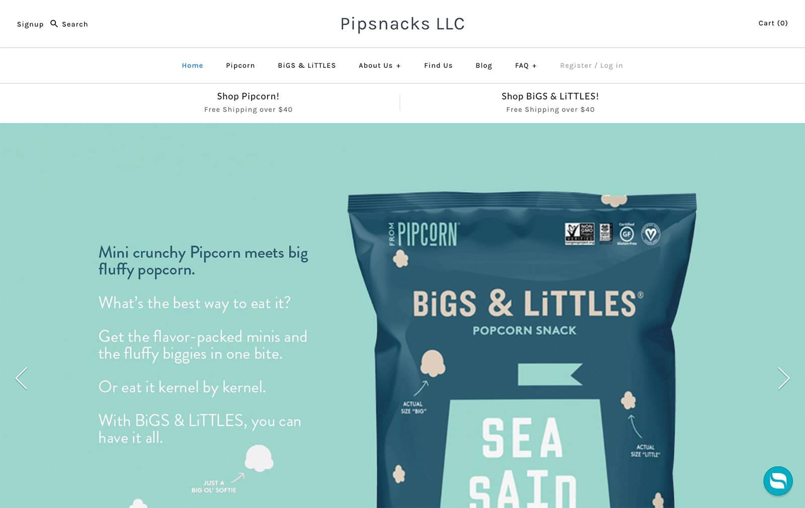
Following the standard ecommerce website design, Pipsnacks LLC incorporates its own charming fonts, colors, and designs while highlighting their products with large imagery and text. The product packaging complements the website’s theme and is very appealing to the eyes.
Playcharms
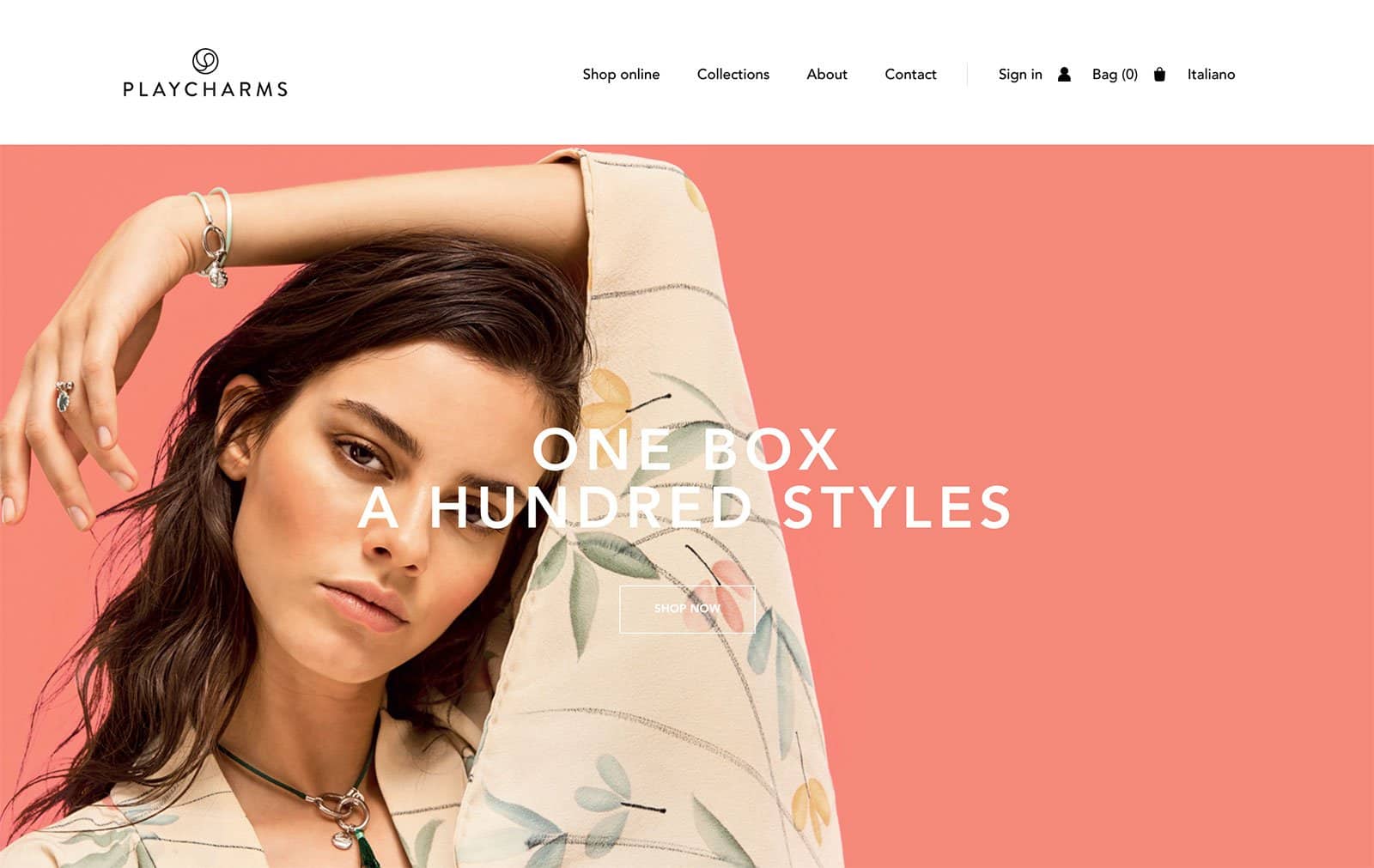
Playcharms has an elegant website design. The theme incorporates asymmetrical photo grids, complementing colors and beautifully photographed images. The brand also incorporates multimedia elements such as video right on their homepage to make it more engaging for the visitors.
Snowe
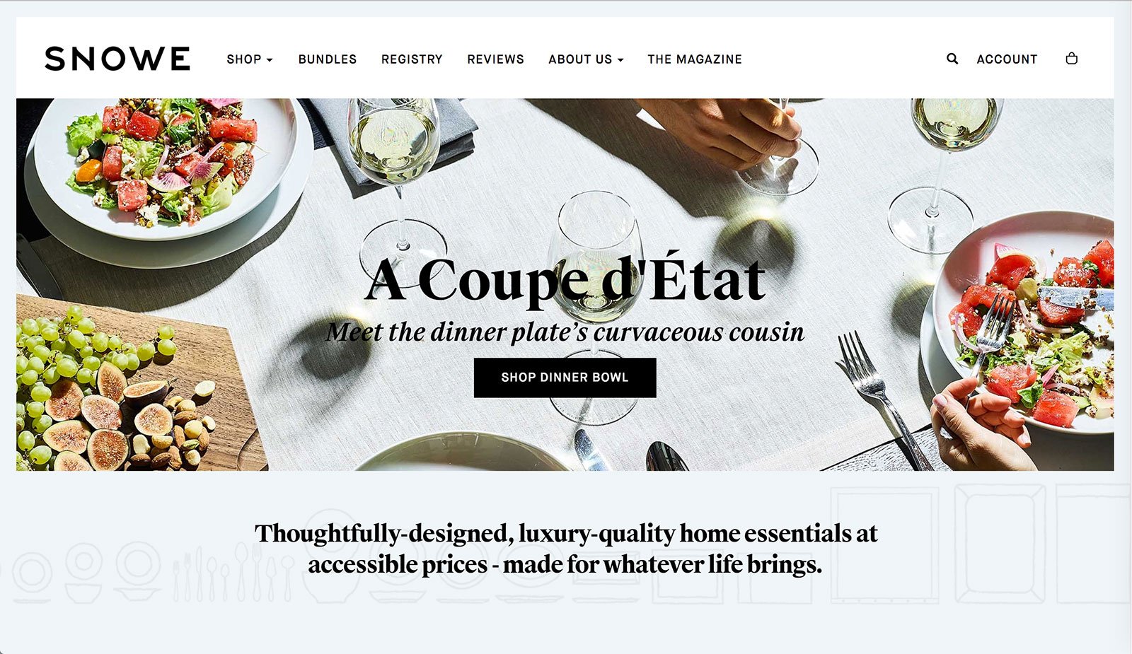
Snowe’s mix and match theme works for their website. Incorporating several different elements into their home page, it almost gives the feeling of looking into a magazine—even the images are photographed in that format. Eye-catching illustrations, a mix of different fonts and varied images on the product carousel make for an eclectic aesthetic.
Soap Co.
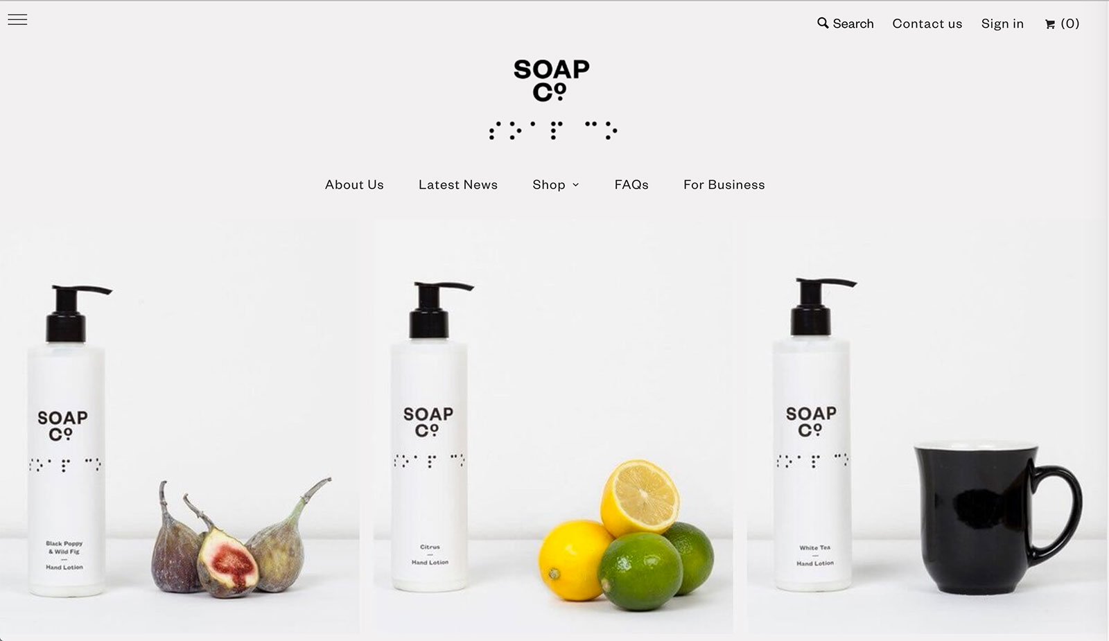
Soap Co.’s ecommerce website opens up to individual images of the products that look like one large photograph of them beautifully placed on a table alongside their key ingredients. The theme of the website has been designed to merge beautifully with their product packaging. The design has a luxurious feel to it and integrates color beautifully into the landing pages, on the otherwise monochrome theme.
Storq
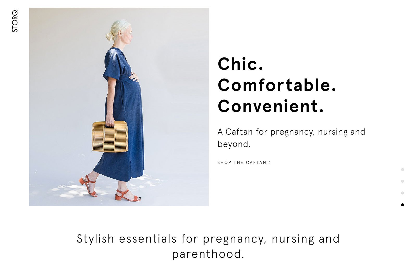
Storq’s ecommerce website aims to make pregnancy clothing stylish yet comfortable. Thus, the website’s design is airy, clean and has a simple linear navigation that highlights the products and their features. The website opens with a video of a model donning the products and the text beside the image brands them as “essentials.” Even though most of the products listed on the homepage are in black and grey tones, the website, due to the models and the way they are photographed, come across pleasantly which likely appeals to their target market.
Tangle Teezer
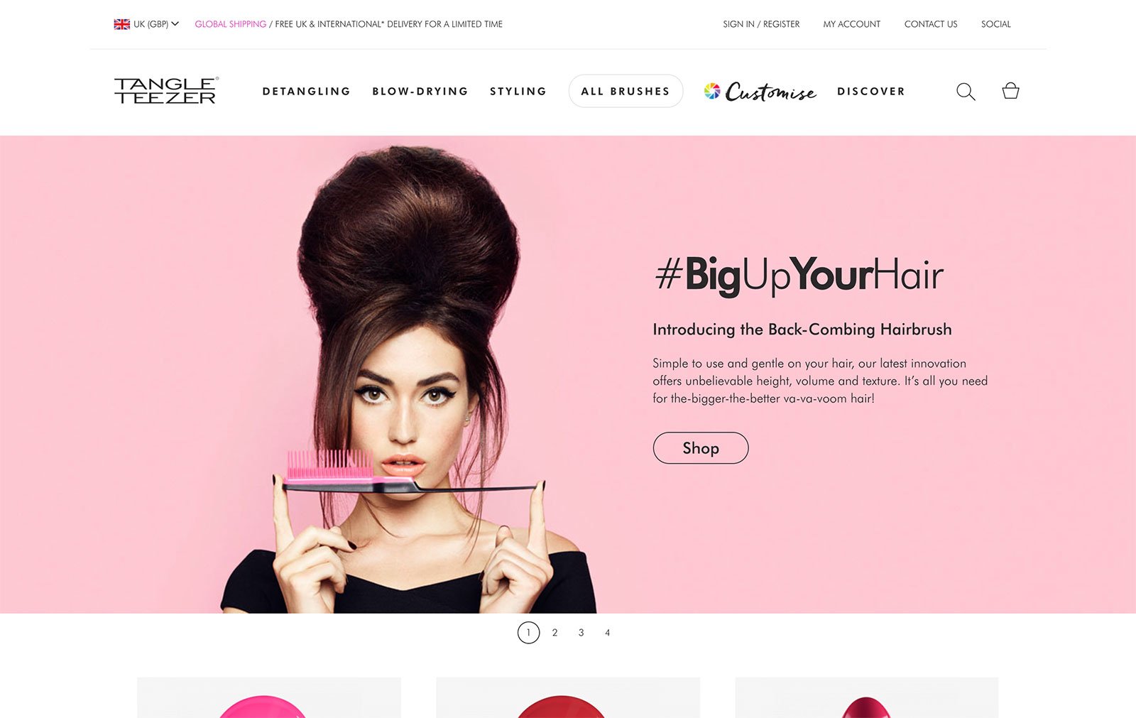
Tangle Teezer’s website is uniquely British: The design, the colors, the models and of course even the products. The web design incorporates pops of color, banners and geometric cutouts to bring out the wild personality of the brand effectively.
Tinker
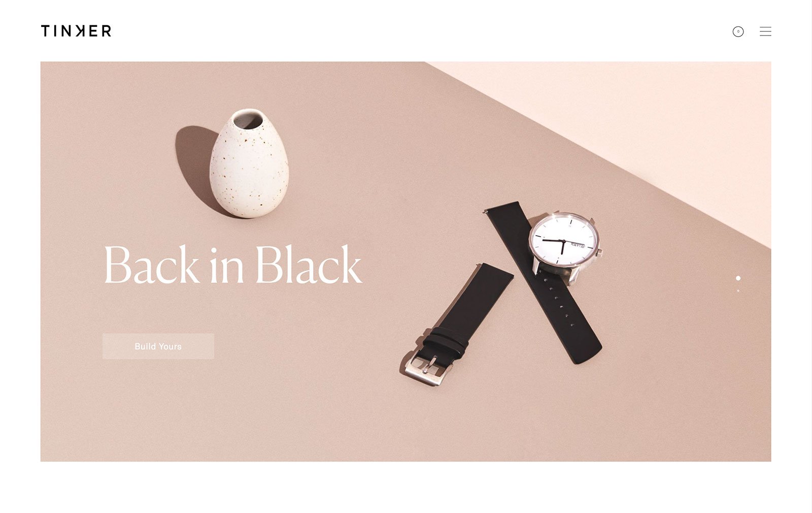
Tinker’s ecommerce site is visually stunning and portrays its products beautifully. The brand describes itself as “clean and timeless without being too serious, thoughtfully-detailed without overt branding, honestly-priced and well-constructed, without unnecessary features or superfluous detailing”—and this would be a great description of their website itself! Clean and timeless.
Two Chimps
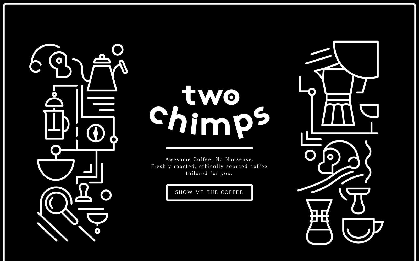
Two Chimp’s ecommerce website has playful content and illustrations that live up to the name of the brand. The design, even though it’s monochromatic grey-scale tones, really does reflect the brand’s personality and character. Unlike typical websites, the brand completely abandons the typical structure of ecommerce websites and plays on a completely different format: it doesn’t show visitors the product immediately. The website is fresh, innovative and funky, just like the brand.
Conclusion
There you have our roundup of 50 of the most beautiful ecommerce website designs on the market at the moment. We hope you gain inspiration for your own ecommerce website and implement some of the ideas so you can ultimately engage your audience on another level.

